Baseline #10 – Exposing Nested Instances, Preferred Values, & more


Hello again! 👋 Wow, it's been a busy few months, but I haven't forgotten about this newsletter! Since my last publish, I've joined the talented team at Webflow, helping to build out the company's design system. It's a big challenge, but the opportunity has been everything I could hope for, and this team has already taught me so much. In other news, I'm also getting married this week! We've been engaged for four years and have had to plan and cancel multiple weddings, but I'm so excited that the month when my fiancée and I will finally be married has arrived!
OK, now for the main topic. Let’s dive into Component Properties! 🎉
Figma Focus: Component Properties
About Component Properties
At this year's Config conference, Figma announced a wonderful new feature called Component Properties. It didn't take long for many design systems designers, including myself, to adopt this new way of building components and variants within Figma, as the feature began to allow for far more instance customization while reducing overall complexity.
In case you haven’t tried Component Properties out yet, along with variants, they’re an additional way to create and organize components that scale within Figma. If you're interested in reading more, I wrote in detail about the different types of component properties in an earlier newsletter. When previously working with variants, each variant had to exist visually and therefore be represented on the canvas. This requirement meant that if you wanted a button with three variant states (default, focused, hover) to support the addition of an icon, six buttons were required: three with icons and three without. Not only was this a bit tedious, but as components become more complex, this way of building can quickly become overwhelming as variant sets can soon become overwhelmingly large. Component Properties helped with just this! Boolean Component Properties can now represent the icon's true or false state. To take it a step further, a Text Component Property can also exist so that any designer can edit the button's label directly within the Properties Panel on the right.
Exposing Nested Instances & Setting Preferred Values
As great as the newest feature was, I couldn’t help but feel something was also missing: showing nested Component Properties.
When building components, it's become a common practice to nest instances within components so that the smaller pieces begin to make up the larger ones. It's often made sense to use Component Properties within those smaller components to easily allow for things such as toggling between light or dark mode or quickly adjusting a layer's visibility, and then to use them on the larger component, too. The inability to surface all the available options within a component risked creating a challenging experience for the designer consuming the component, as it wasn't clear what those available options were without deep-clicking every instance within.
With today’s beta launch from the Figma team, that problem has now been solved! To understand exactly what’s changed, let’s take a look at an example.
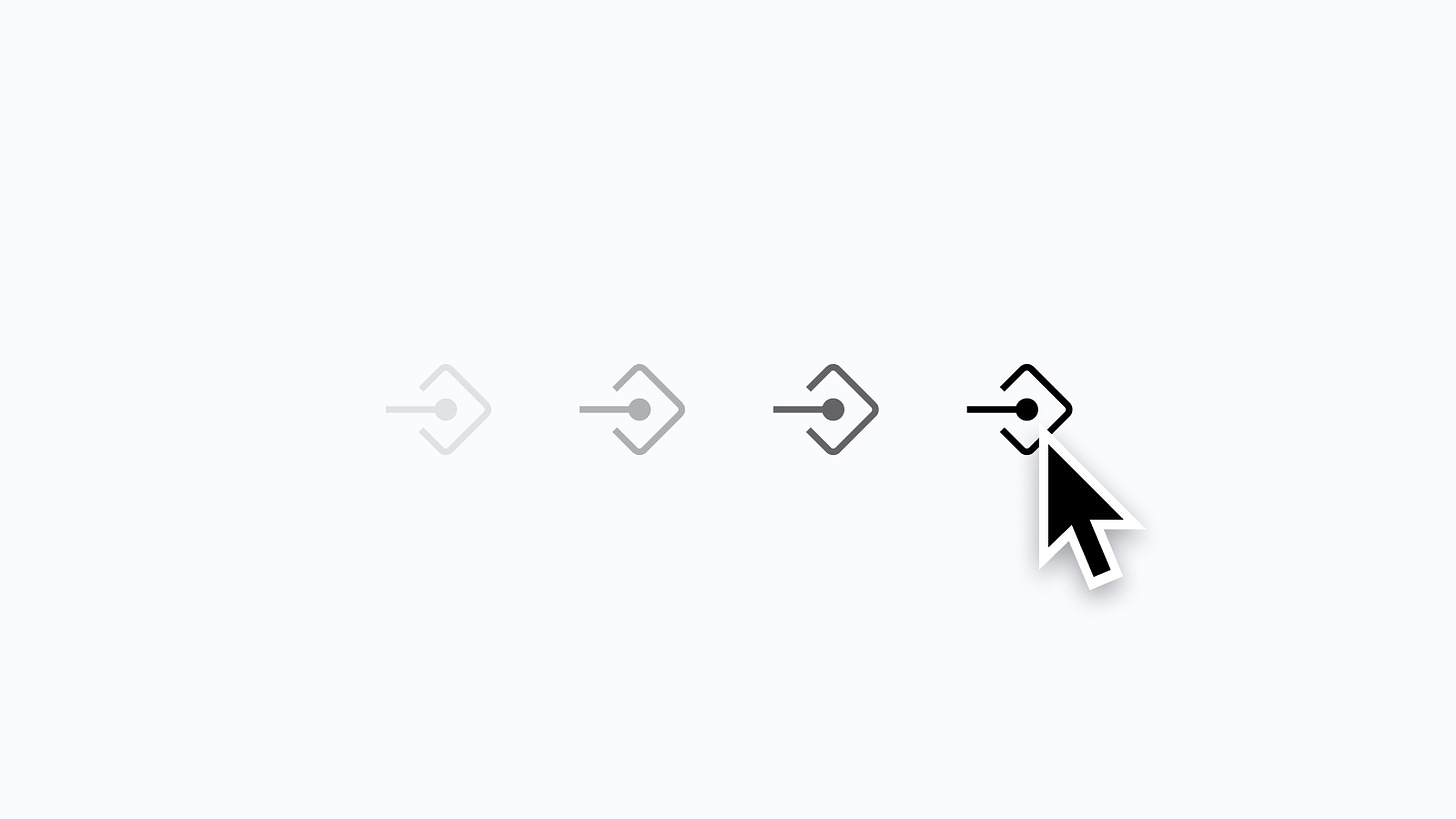
Let’s Try It: Exposing Nested Instances

In the example above, I have a StatusBar component from iOS, and within this component are two nested instances: _StatusBar-time and _StatusBar-battery. When selecting the StatusBar component, Figma only shows the variant properties available for the component itself and none of the ones associated with either of those nested instances. As mentioned earlier, without clicking on each instance, a designer would never know that there are properties that can (and perhaps should) be adjusted. Thankfully, this is now super easy to change!

Step 1: Select the top-level component or variant group, and within the properties panel on the right, click the plus icon and select the new option that reads “Nested instances”.

Step 2: Figma will open a modal that allows you to view and select all nested instances. Checking each instance will create a new exposed nested instance.

Step 3: Reselect the top-level component or variant group, and now within the Properties Panel, all available variants and Component Properties should be available to see. By selecting only the StatusBar component within the layer list, I can see and adjust any option, such as the theme, time, charge status, and more.
Preferred Values

On top of everything above, Figma also shared a new feature that lets you set a preferred value for any instance within the main component. As an example, within the TableRow component above, I have a Switch selected. Because only certain elements can sit within a TableRow component, such as chevrons or labels, setting a preferred value can quickly communicate with a designer which instances are OK to switch to and which aren't.
If you're familiar with the concept of slot components, which are placeholder components that are intentionally empty, ready to be swapped for another instance, preferred values might already have your mind racing. For example, imagine creating a modal with a series of slot components with preferred values set. The top slot component may be able to be instance swapped with perhaps a heading or breadcrumb menu, while the one beneath may only be swapped with a secondary heading or paragraph component. This way of working reduces the need to immediately detach a component just to add content within it, and I don't know about you, but I think the possibilities here sound amazing!
Simplified Instances

If there's one thing we know about components, they can be complex and may contain layers that aren't useful to the designer who's ultimately using that component within their design. In the example above, the MessageBubble component has several layers to help create the structure and the visual of the iOS message bubble. For any designer who’s using this component in a design of their own, it’s unlikely that the tail ever needs to be referenced or even seen within the layer list, and the use of Auto Layout seems to make the list of layers quite noisy.
To help with this, Figma also announced a new feature that allows designers to choose to simplify all instances within a main component. Once enabled, all layers without properties and layer details, such as fills, effects, layouts, and more, are all deemphasized within the component’s layer list. Clicking “See all layers” allows any of those layers to be shown just like usual and hidden again on the following selection.

Simplify instance is a fantastic little feature that I didn’t necessarily know I needed, but for those highly complex and overwhelming components that exist within most design systems, I’m excited to use this one.
Phew!
Whew, was a lot! I’m so excited and inspired by how all of these improvements will allow designers to create components that are easier for others on their team to understand and use within designs of their own, and I can’t wait to see how you use them, too!
Getting Started (repost)
From what I've experienced, the easiest way to begin using component properties is to update existing components to use text properties. Starting with this one, in particular, provided me with a lot of insight and learnings about how the new feature works while keeping the risk of breaking existing instances relatively low, too!
Here are a few more helpful links and resources worth bookmarking:
- Exolore component properties, from the incredible Support team at Figma.
- Component Properties (Case Study), by my good friend Vic, who designs at Microsoft.
- An excellent Twitter thread from Molly Hellmuth, with five step-by-step component property examples showing how and when to use them.
In case you missed it...

🏝️ Dynamic Island may be the most significant update to iPhone that we have seen since the launch of the iPhone X in 2017. If you’re ready to begin designing for Dynamic Island, I recently published a new update to my iOS 16 UI Kit for Figma, including several interface updates made for iPhone 14 Pro and, of course, the Dynamic Island component. Like many, I’m excited to see how this new feature, once an unpopular but iconic notch, feels to use and evolves with time.
Recent bookmarks
- When it comes to wallpapers, this month, I’ve been using Canopy’s Mystic wallpaper pack. Hex is my current favorite!
- Molly Hellmuth wrote a great thread on her biggest takeaway after 100+ Figma tutoring sessions.
- Rafa Conde on designing the onboarding flow for the delightful app Along. (📼 Need an invite? I’ve got you covered!)
- Color & Contrast: A comprehensive guide for exploring and learning about the theory, science, and perception of color and contrast by Nate Baldwin.
- Gavin Nelson shipped a new icon for 1Password 8, now available for iOS, and it’s a thing of beauty that I love seeing on my Home Screen.
- Please consider donating to help those affected by the conflict in Ukraine if you can. 🇺🇦
Say hello!
I always love hearing from people, and if you enjoyed this, please reach out! You can find me on Twitter @joeyabanks.