Baseline #11 – The Easy Way to Build Responsive Components

Hello again! 👋 Phew, life has been busy lately! Since last publishing, I’ve gotten married, completed my first five months at Webflow, and have been thinking a lot about where and how I want to spend my time to continue to share with all of you.
With so much changing in the world of social media, there’s still one thing feels certain: this newsletter! I’m excited to continue writing into 2023 and to share even more about the things I’m learning within the world of design systems, working with teams, tools I’m using, and all the best Figma tips and tricks. Speaking of which, let’s get into this newsletter’s main topic!
Figma Focus: building responsive components
Auto Layout
When it comes to building components in Figma, either for yourself or your team, it’s often necessary that those components work well within various situations and for different screen widths. This requirement usually leads to either applying constraints to many layers or adding Auto Layout (SHIFT + A), and this layout property can be applied to frames within a design.
However, for many designers, including myself, Auto Layout can sometimes feel intimidating, especially if you’re new to Figma’s feature. Applying the property usually isn’t enough to make the design responsive, as it’s almost always required to make adjustments to achieve the needed layout and responsive behavior. In my first few years of using Auto Layout within Figma, I remember the process of using the advanced layout tool to feel challenging, and to be honest, the thought of needing to do this for years to come for every design felt daunting.
Overwhelmed and nervous, I set out to find ways to improve my workflows to make Auto Layout more accessible and perhaps even something I would look forward to relying on as I designed. I’d love to share the technique that ended up helping me the most with you!
Applying Auto Layout: the old way 😞
As I think back, I remember feeling so challenged when using Auto Layout—building a component on the canvas to look as it should, Applying Auto Layout, and watching it break when used in an actual design. Does this sound familiar to you? My workflow would look like this:
Step 1: Design and create a component
For me, the first step was always to create the interface I needed and turn it into a component (CMD + OPT + K), readying the design for either myself or another coworker to use within a design.
Step 2: Add Auto Layout and make adjustments
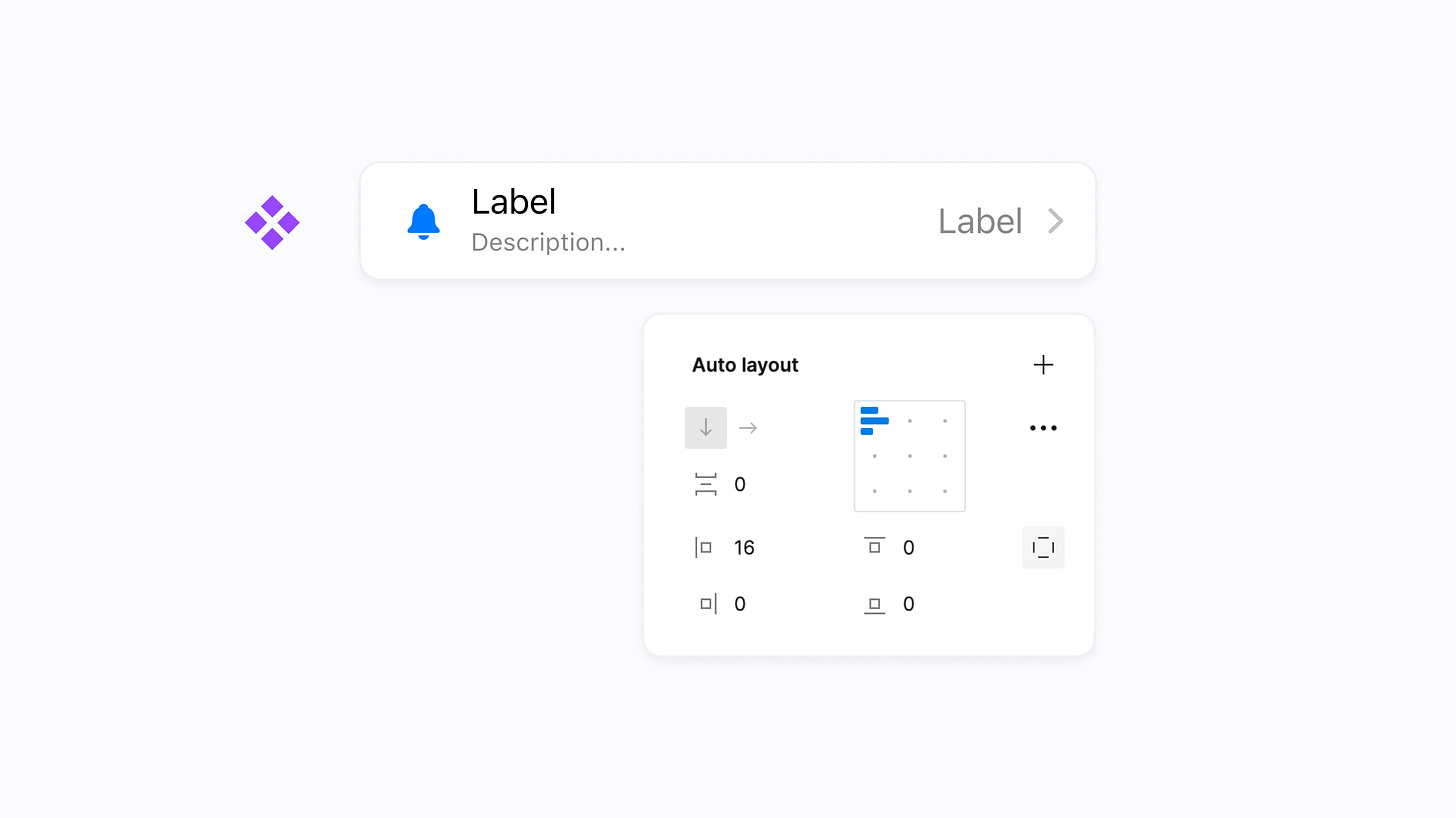
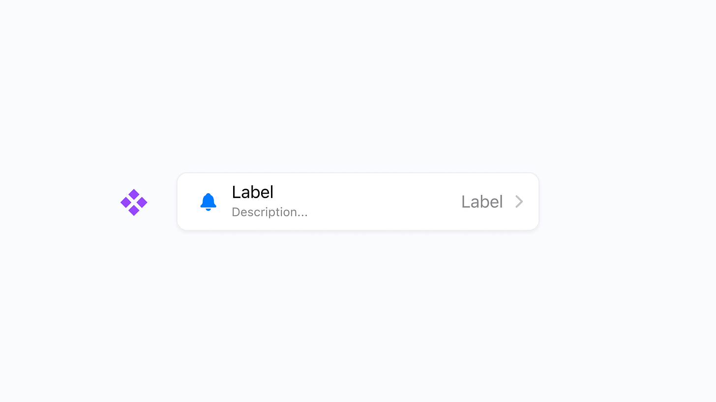
Knowing that the interface, in this case, a TableRow Cell from iOS, needed to be responsive with the device, I’d add Auto Layout. Content within the component would often shift around during this step. However, after a bit of tinkering, I was generally able to select the correct settings to get the component to look as expected.
Step 3: Use an instance
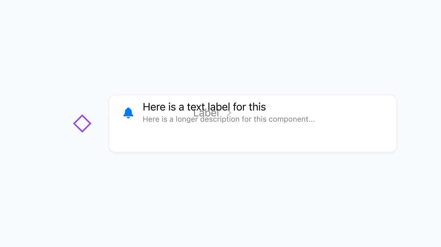
Next, I finally felt ready to use an instance of the component I had just created! Except, this is where things would break as soon as I added in the appropriate content or adjusted its size. In this case, I would have expected the content to remain centered within the container, regardless of the height, for the text to fill the container, and for the label and caret to always remain at the right-most side.
This quickly led to step 4: overwhelm.
Applying Auto Layout: the new way ✨
When I think about my original way of applying and working with Auto Layout compared to my approach today, there’s one critically different thing: the order in which I begin to test the results of applying Auto Layout.
I’d previously waited until the very end to see if the component’s layer structure and Auto Layout settings were working correctly, and if not, I felt like I needed to go back to square one to start over. With my approach today, I first like to drag out an unfinished component instance and stretch it in bizarre and unexpected ways to see what happens. If I can make this component work as expected in the strangest sizes, I’ll feel confident that it’ll work for nearly all situations. To highlight all of this a bit more, here’s how that approach looks:
Step 1: Without finishing the design, create a component
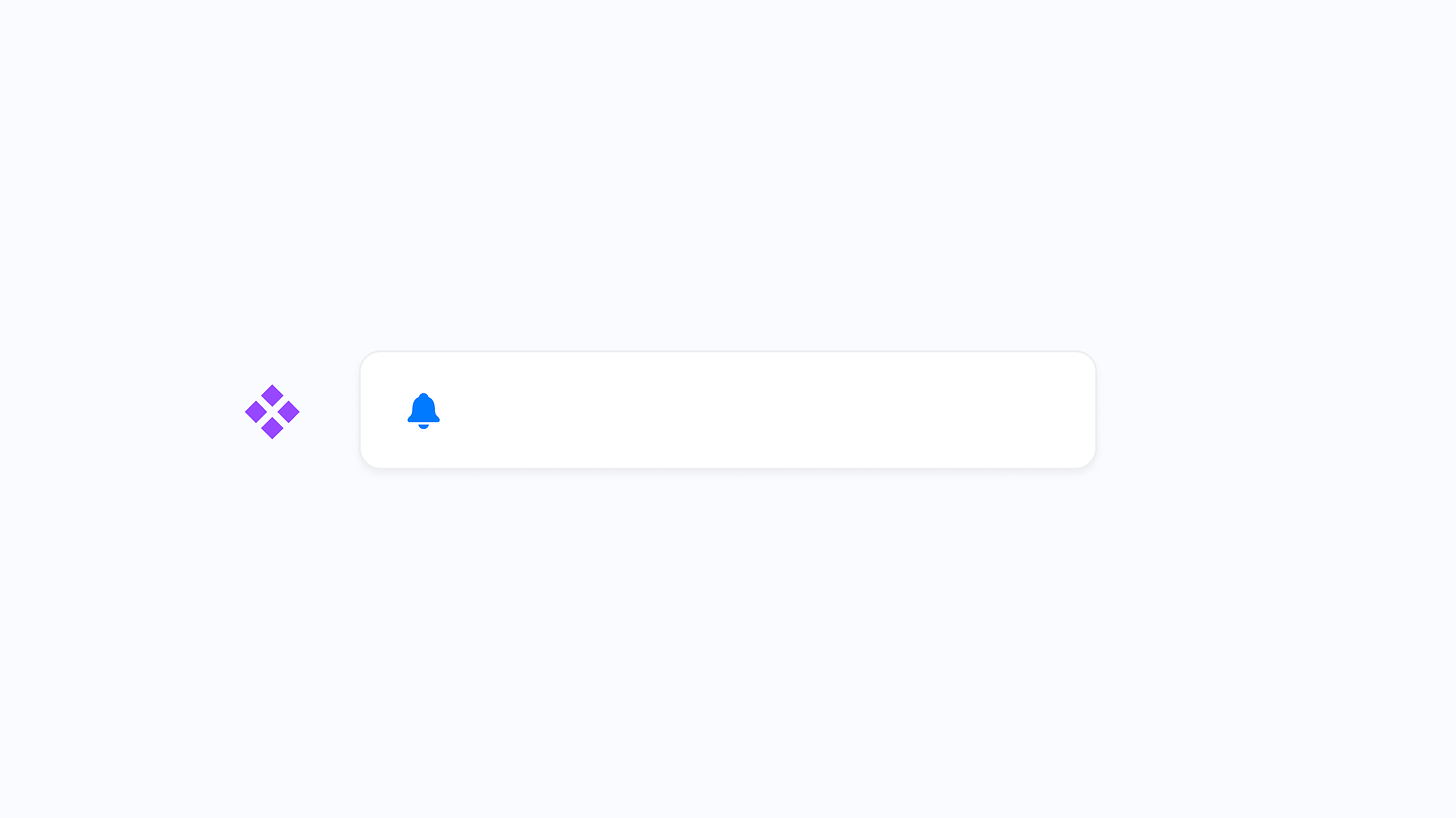
Thinking back to the TableView Cell component, I’ll first create the frame, maybe adding a piece or two of content, and then almost immediately make a component (CMD + OPT + K) out of the unfinished design.
Step 2: Create an instance of the unfinished component

With that component created, the next step I’ll take is to make an instance from the unfinished component, which can be done by holding OPT and dragging.
Step 3: stretch and resize the component

This next step made it all click for me: adjust the sizing of the unfinished instance to see what’s working and, more importantly, what’s breaking. I now have this brand new point of reference as I adjust the original component, and I can immediately see how my Auto Layout-specific settings impact the instance. For me, this point of instant visual feedback has been so helpful!
Step 4: Add remaining content and make adjustments

Finally, it’s time to add the remaining content as you continue to make adjustments. In this case, I’ll add the title, description, label, and chevron while making changes to the sizing and alignment properties that Auto Layout allows. As I go, I still have this point of reference to look at, and because the instance has resized substantially, I know if the changes I’m making result in the correct visual layouts!
A small change that works
This approach may seem like such a tiny change when reading about it, and really, that’s because it is! By simply modifying the order in which I build components and use layout settings, I can more clearly understand the controls and settings within Auto Layout, and I know that the component will work well for anyone who uses it within a design of their own.
Does this method work for you, or do you have other Auto Layout tips? I’d love to know!
In case you missed it...
Abstract wallpaper pack

If you're looking for a new wallpaper to keep devices feeling fresh, I decided to try something new and created my first wallpaper pack! This one includes 9 6K resolution wallpapers in various colors and styles.
Interview kit

With so many friends currently looking for their next opportunity, I wanted to create and share something small to make the search easier! I made a Notion template to save, organize, and add notes for every position you explore. Grab the template for free here.
Recent bookmarks
- Colors used within a design can be both beautiful and accessible. For several side projects, I’ve been relying on this random accessible color generator and can’t recommend it enough!
- I've started to use timers to help me create distraction-free working blocks and to help with this goal, I've been using this minimal and customizable timer that sits right in your Mac's menu bar.
- From Xerox Alto to Mac OS X Snow Leopard, this site is dedicated to the history of user interfaces.
- Figma recently published this excellent interview with Jordan Singer, the creator of Diagram and now, Magician: How Magician uses Figma’s text review API.
Say hello!
I always love hearing from people, and if you enjoyed this, please reach out! You can find me on Twitter @joeyabanks.