Baseline #14 – A Guide to Variables in Figma

Hello again! 👋 Phew, what a busy couple of weeks! Since returning home from Figma’s 2023 Config conference, I’ve been spending time in the tool, working to adjust all of the various component libraries to use the many new features now available.
In this edition of the newsletter, and perhaps in the next few to come, I’d love to dive deep into each of those new features, uncover what’s new, and share all that I’ve learned as I make my way into everything. Let’s start by talking more about variables, what they are, how I’m beginning to use them, and a few shortcuts to help make workflows and creation more efficient!

All About Variables
Within almost every new product update, it seemed that Figma was working to bring new value to the design tool and introduce ways in which the two functions of design and engineering could become closer. The launch of components allowed designers to create and maintain reusable assets, such as buttons, inputs, and controls, often matching those building blocks in code with Figma. Styles let us more concretely define color, typography, and effects within designs so that these more primitive elements could be made consistent and accessible across platforms. For the first time, developers could reference a name representing a color or type definition instead of the raw output within the Inspect Panel.
But even with those added features, one important component (no pun intended!) had always been missing: the ability to create and use preset values or tokens within designs, such as for corner radius or spacing measurements. Support for repeatable values within Figma has finally arrived, and the Figma team has, of course, named this new feature variables!
Variables allow us to create, store, and use reusable values throughout Figma, such as text strings or colors. A number can be created and used to represent a system’s corner radius value or a color always intended for use as a button’s background color can be defined and referenced.
To understand more, let’s talk about the various types of variables available and supported within Figma today and how to apply each!
Creating Variables
To access the new Variables modal, where variables are created and managed, click on the canvas when inside a file so that no objects or layers are selected. This can also be done by pressing ESC. Within the right sidebar is a new section called Local variables, and clicking on the settings icon to the right launches the Variables modal. Here is where it’s possible to view all variables already made or to create a new one!

💡 Tip: Duplicate existing variables by selecting a variable row and tapping Shift + Enter to create variables even more quickly. (Thanks for this one, Molly!)
Variable Types
Within Figma today, four types of variables are supported: color, number, boolean, and string types.
Color: Color variable types refer to any variable that supports a color definition, and these can be applied to either fill or stroke colors.
Number: Number variable types are used to assign a numerical value to a variable’s definition. Once created, these variable types can be applied to text layers (to display the number in the text layer itself), corner radius values, minimum and maximum widths or heights, and padding or gap spacing values.
Boolean: The boolean variable type lets us assign boolean values (true or false) to a variable, with its starting value as the default value when created. Boolean variables allow for the control of layer visibility, such as the ability to choose to display an image or container when within desktop-sized layouts but to hide it when designing for mobile. It’s also possible to bind them to variant instances. Note: at the moment, it’s only possible to bind them to values within component instances, not those values within the main (original) component. I hear there’s a rumor that this feature is coming soon, though! 🤞
String: Last but not least, the string variable type allows for creating specific strings of characters to be made and used throughout components and within designs. This variable type can be applied to any text layer, including those nested within instances. Because text strings can be created using any language, I can quickly see how these variable types will also be helpful for those focused on localization efforts and general content management within the design tool, all through modes, which I’ll share more on soon!
Applying Variables
Color Variables
If you’re already familiar with how to apply a style in Figma, applying a color variable should feel just as familiar. With an object on the canvas selected, tap the four-dot style icon in the design panel's fill or stroke sections. Both styles and variables appear within this list, but previews for styles show as circles, whereas previews for variables now show as squares.

Note: At the time of writing this post, variables cannot support effects, such as shadows or blurs. If your system uses many shadows that vary between modes, it may make sense to hold off on adopting them for a bit!
Number Variables
Applying number variable types to a design is done directly from the input field, where the control is located. A variable icon will be on the right of the input within any field that allows variables to be used. Selecting this icon shows a list of all supported variables, and the desired variable can be selected by directly clicking or using the up/down arrow keys.

With a variable applied, the calculated value that the variable equates to is shown (in this case, it’s 4px) and appears as a new gray container within the input.

💡 Tip: With your cursor inside an input, tap the equal = key on your keyboard to launch the variable list quickly, or hold Shift + click. To remove a variable, click into the input and tap backspace twice. Time saved!
Boolean Variables
To apply a boolean variable to control a layer’s visibility, first, select the layer and right-click the visible/hidden toggle from the right sidebar. Each available boolean variable is shown and can then be applied to the selected layer.

As far as I know, this is the only feature within the design panel that is based on a right-click interaction to access and use. Because of that, I found that it does take a little extra effort and practice to remember, but becomes natural pretty quickly.
To bind a boolean variable to an instance’s variant properties, hover next to the variant control, and locate the familiar variable icon. From here, each available boolean variable appears. And again, at least at the moment, this ability to bind a variable to a variant control is only available for an instance of a component, not yet for the main component.

String Variables
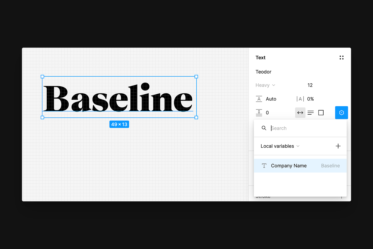
String variables can be applied to text layers. With a text layer selected, the variable icon appears within the Text section of the design panel, and from here, it’s possible to choose either a string or a number variable, which is so handy, as we may want to use number variables directly within a design.
Variable Aliasing
Aliasing, which refers to linking one variable’s definition to another already existing variable, is also supported! This process allows for the implementation of design tokens and creates a more efficient process when making or managing updates, as dozens of aliased items can refer back to a single variable.
As an example of how aliasing can be helpful in the design process, imagine creating variables for your core set of colors, including blues, greens, reds, and yellows. These color values may be defined as a scaling series, such as yellow100 or blue400, and once defined within a collection, you can create new variables that refer to those global colors. For instance, a variable called primary-button-bg can reference blue400, and so can another variable, such as primary-control-bg. This new linkage means that if the brand ever changes and the core colors are adjusted, only the initial set of global colors needs to be changed, and their color changes will propagate downwards to the variables that reference them, such as primary-button-bg and primary-control-bg.
The best part? Aliasing works with string, boolean, and number variables, too! If your system uses base-2, creating a collection of variables that align to the base-2 system may be helpful, and then aliasing those within spacing variables. Creating a collection where variable “2” equals 4px, variable “3” equals 6px, variable “4” equals 8px, and so on, and then another collection where a variable, such as space-4, references variable 4, resulting in an output of 8px, is a new approach I’m trying out!
To create an alias for a variable, right-click on an already defined variable’s value and choose “Create alias,” then select the “Libraries” tab, which shows all compatible variables, ready to reference.

Collections & Groups
With all of these variable types now supported, trust me, it doesn’t take long for the total number of variables to add up! Throughout Figma, I believe good organization goes a long way, and the team has provided both collections and groups for us to use to help keep things tidy and easy to locate.
Collections
Variable collections refer to specific sets of both variables and modes. We can use them to organize and keep related variables close together, and because collections allow for different modes to exist, collections are a critical part of the process for variable creation.
For example, modes for desktop and mobile breakpoints may exist within a spacing variable collection, whereas within a color variable collection, modes for light and dark themes may exist, and because of this, collections are quite helpful. To create a new collection, select the dropdown at the top left of the Variables modal, and choose "create collection.”
💡 Tip: If there’s an entire collection of variables you would prefer to keep private when publishing, place either a period or an underscore at the start of the collection’s name, similar to components. This feature can be helpful for global sets of colors or, like in the above example, sets of number scales, which may not be for use within production-ready designs.
Groups
Variable groups allow for even further grouping of variables. I’ve started to think of variable groups as little folders that can hold larger sets of variables. If, in your system, you have dozens of color variables that apply to all buttons or all backgrounds, it may make sense to create a larger group that keeps all similar variables close by and easily accessible. Groups can be created by right-clicking on one or multiple variables and selecting "new group with selection.”

In the example above, three groups have been created: “UI-component”, “UI-background”, with either “Base” or “Elevated” as the final subgroups.

In my own work, I’m choosing to create groups as often as possible, as they help visually separate the many variables within the system. For aliased colors, I’ve created groups for fills, strokes, text, and icons, and for the global colors, I’ve created groups for each core color, such as blue, red, or green. (Also, am I the only one who finds this view to be so satisfying?)
💡 Tip: When creating a new variable or renaming one that exists, type “/” in the name to create a new group, where the string after the “/” becomes the new group’s name.
Modes
Modes exist within variables, allowing for additional context within a variable collection, such as theming or size specifications.
For example, within the “Sizing” collection below, I have two number variables: size-screen-width and size-screen-height, and three modes: iPhone 14 Pro, iPhone 14, and iPhone SE.
Having these modes available means that I can take a design that uses the width and height variables, and by changing its mode, I can adjust for the device I intend to design for.
Each row is the variable within the Variable modal, with each column representing the mode. To create a new mode, tap the “+” towards the right of the modal.

By default, when creating a new variable, the single column will serve and show as a value for the variable and not necessarily a mode. Modes only exist when two or more columns of values are present.
Because collections allow for differing modes, this means that by organizing our variables by collection, it’s easy to create modes for various applications, such as light/dark themes, differing languages, or, as seen in the above example, screen size.
💡 Tip: Whenever a mode is needed, but its use doesn’t apply to other variables in the collection, it’s a sign that a new collection may be necessary. That said, it’s not possible to move a variable from one collection to another, at least at the time of writing, so planning here will be an essential step in the process!
Switching Modes
Let’s imagine that a design supports light mode and the iPhone 14 Pro mode via applied variables, just like in the example above. If we’d like to switch that entire design to a dark theme or adjust its dimensions to support iPhone 14, the next step is understanding how to change into that different mode.
First, make sure that the selected item uses a variable to adjust the mode in use. If no variable is applied, Figma won’t show the option to switch modes. With the design selected, head over to the right panel, and within the Layer section (or within the Page section if intending to adjust the mode for the entire page), there’s a new icon that resembles two variable icons stacked on top of one another. Clicking this reveals all of the different modes available to switch into, all based only on the variables in use. If the selected item does not yet use a variable from the “Sizing” collection, those available modes won’t be shown.
Mode switching is available for layers, frames, components and component sets, sections, groups, and finally, entire pages, too!
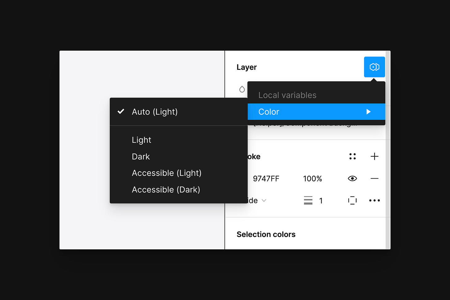
💡 Tip: Selecting Auto means that all objects nested inside take on the modes of their parent container, and if no specific mode is set, all objects then fall back to the default mode, shown in parentheses. The mode that’s set to Auto is based on the first (or left-most) mode created within the collection.
Scoping
When creating variables for various files and component libraries, it’s helpful to think about how and where those variables should or shouldn’t be used—not to over-restrict, but instead as a way to improve the experience designers have when using the system.
Ideally, number variable types created to represent spacing and padding values should only be available for selection with those specific fields and not used within inputs such as corner radius. Similarly, color variable types that define fill or stroke options shouldn’t be surfaced when selecting a text layer’s color. This way of thinking within Figma is called “scoping,” a feature available for all variable types!
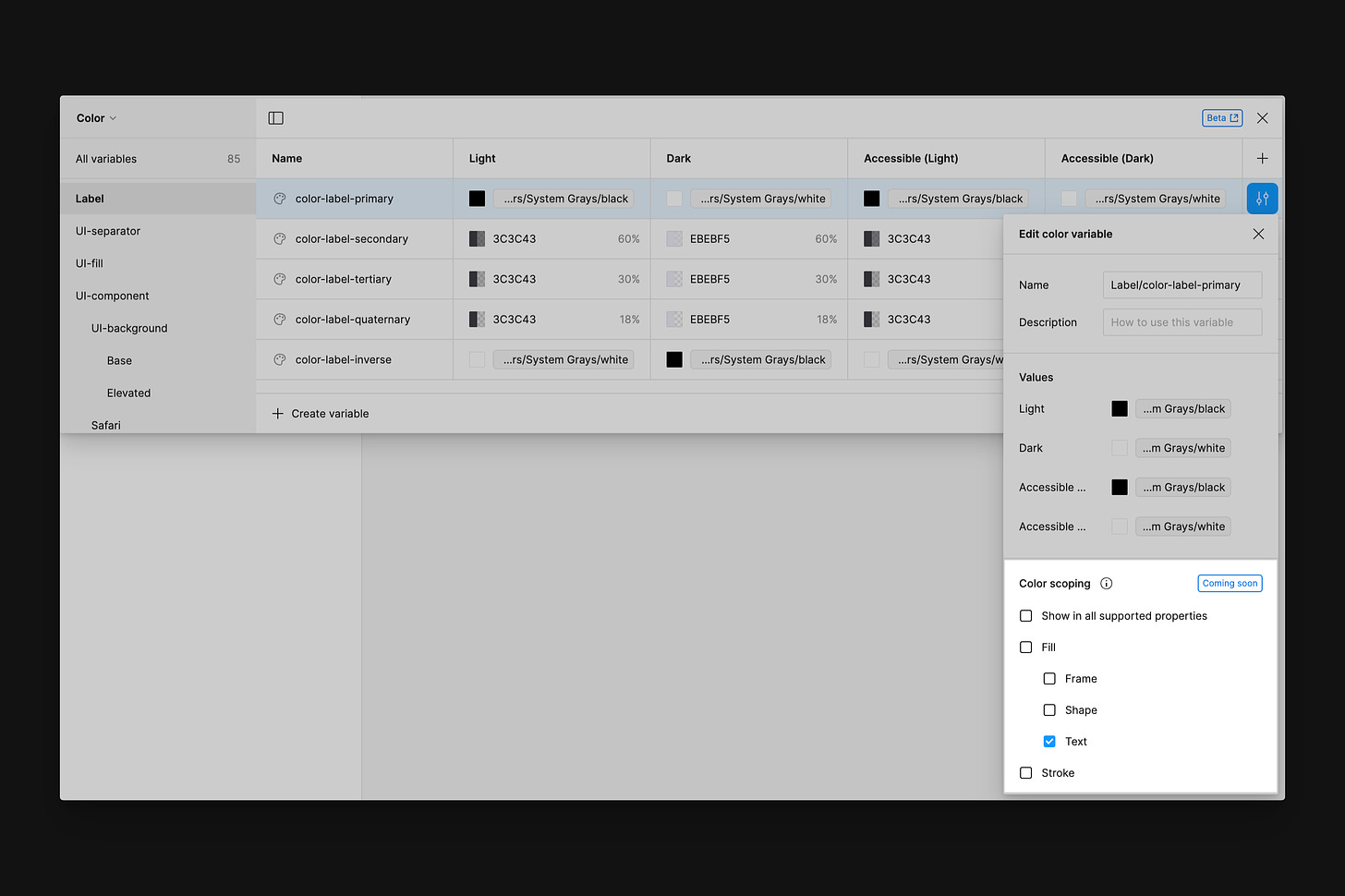
To access scoping, tap the configure icon at the end of a variable’s row. This button launches the Edit variable modal, which can further define a variable’s use and the feature to limit its scope. In the example above, I can limit the color-label-primary color variable to only be used for text and not within frames, shapes, or strokes. Note: Figma has noted that it’s possible to apply these selections to color variables at the time of writing, but scoping won’t yet take effect—but the complete feature should be coming soon!
💡 Tip: Any word within the variable’s description field becomes a searchable term that can be helpful when applying the variable. For example, for any variables specific to dividers within the system, including the word “separator” here may be helpful to improve discoverability.
Styles vs. Variables
Perhaps the most frequent question designers are asking with the launch of variables is, “With variables, should I ever use styles again?” and right now, I believe that answer still is “yes”!
Within Figma, styles are still great when referencing multiple values at once, not a single value, as variables only support one raw value. Unlike variables, styles also support the organization of both gradients and effects. So, while variables bring several advantages, such as their ability to align more directly to code and to offer more straightforward methods of organization, styles still have their purpose.
Closing Thoughts
I’m so happy that variables have finally arrived in Figma! I’ve already found that by using a combination of variables and modes, I’m able to increase both the speed and efficiency within the design process, as I’m able to design an entire screen or flow and, with just a few clicks, adjust the selection for a whole different theme, size, or language. Dragging a design from one frame that uses a light mode to another frame that uses a dark mode and seeing all parts of the design adjust almost instantaneously still feels like magic, as for so many years, it was an extremely manual and tedious process.
Within the component libraries I help maintain, I’ve switched from styles to variables, and the thing I love most is how the gap between design and engineering is beginning to close just a little more. Variables force me as a designer to truly ensure that themes, such as light and dark modes, completely align, and the burden of ensuring that colors switch correctly between those themes is now on the designer first rather than always on the developer.
That said, one thing I still find to be a little challenging within this new way of building and viewing components in Figma is that so much of the previous on-canvas visual representation is now absent using variables. Previously, if there were two density sizes used or if a layer was toggled as hidden within a particular situation, that was easy to see, as we had to build it out as a visual variant. With variables, much of that information, such as sizing, booleans, and color adjustments, is all within the Variables modal and not on the canvas. Using sticker sheets may help solve this problem, but it adds another layer of complexity and abstraction to the library and increases maintenance. While it's hard to imagine going back to the previous world of only using styles and variants, I think it will take a bit of new creativity to continue communicating to other designers everything a component is and everything a component can do within Figma.
If you haven’t yet implemented or even played around with variables in Figma, don’t worry! You’re not behind, and we’re still very much in the earliest days of variables—and of all these new features within Figma. I hope this post gives you all you need to begin playing around and implementing variables in your own work!
In case you missed it...

For anyone wanting to become more comfortable with any of Figma’s newest features, such as variables, prototyping, auto layout, or the world of design systems and how to structure them within the tool, I’d love to help you in 2023! I offer 1:1 or 1:many training sessions, and I am here to partner with you!
Recent bookmarks
- “Naming is hard? No it’s not. Getting people to agree on something is hard.” With nearly everyone thinking even more about naming with the launch of variables, Dan Mall’s recent talk was an inspiring and encouraging one to watch. Your next component - Dan Mall (Config 2023)
- Apple has updated its Human Interface Guidelines to include visionOS now. Although we’re still a long way away from the arrival of Vision Pro, I’m finding these docs incredibly interesting to read through as a way to learn and prepare!
- Supercharge your Design System with Design Tokens from Jishnu Hari is an excellent read and offers insights into naming practices and aliased tokens.
- Realtime Colors is an excellent little tool that helps you visualize your color palette on a website.
- View the Washington Post’s accessibility page, which features its accessibility checklist, testing strategies, and necessary considerations.
Say hello!
I always love hearing from people, and if you enjoyed this, please reach out! You can find me on Threads @joeyabanks. 🧵
Baseline is a reader-supported publication. To receive new posts and support my work, consider becoming a free or paid subscriber.


