Baseline #19 – Config 2024: Everything New in Figma

Hello again! 👋 Figma’s 2024 Config conference just wrapped up, and the team shared several new and exciting product announcements. While the updates felt a little more iterative this time around rather than innovative, what Figma shared seems to be paving the way for all that’s near and far ahead.
In case you missed the product keynote, or if perhaps you’d just like a recap of the highlights from the perspective of a design systems designer, I’d love to share all that’s new with you in this newsletter. There’s quite a bit to cover, so let’s dive in!
Config 2024
UI3: A refreshed Figma
Before jumping right into all of the new AI and product announcements, I’d like to focus on one of the most significant product changes: the introduction of a redesigned and refreshed Figma.
Perhaps just like many of you who are reading, I started using Figma over eight years ago now, and truthfully, its design has always remained relatively unchanged. In their keynote, Figma shared this image of one of the very first public releases of Figma, and if you were to look at this image and squint, I bet it would feel almost identical to how you know Figma to exist today. (For those who just tried that, see what I mean?)
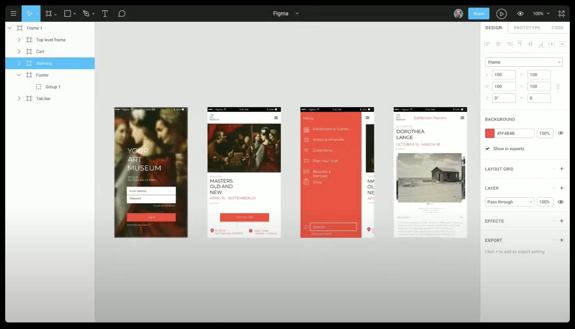
Of course, Figma has changed a lot since those early days. New features and ways of working have made their way into the design tool, and like any piece of software, it’s tough to know where to put everything after a while, as you quickly can run out of virtual rooms and crevasses. Sometimes, you need to embark on a minor remodel or addition to the familiar space you’re in, modernizing and updating the foundation below, and that’s what Figma seems to have done with UI3, their latest product design.
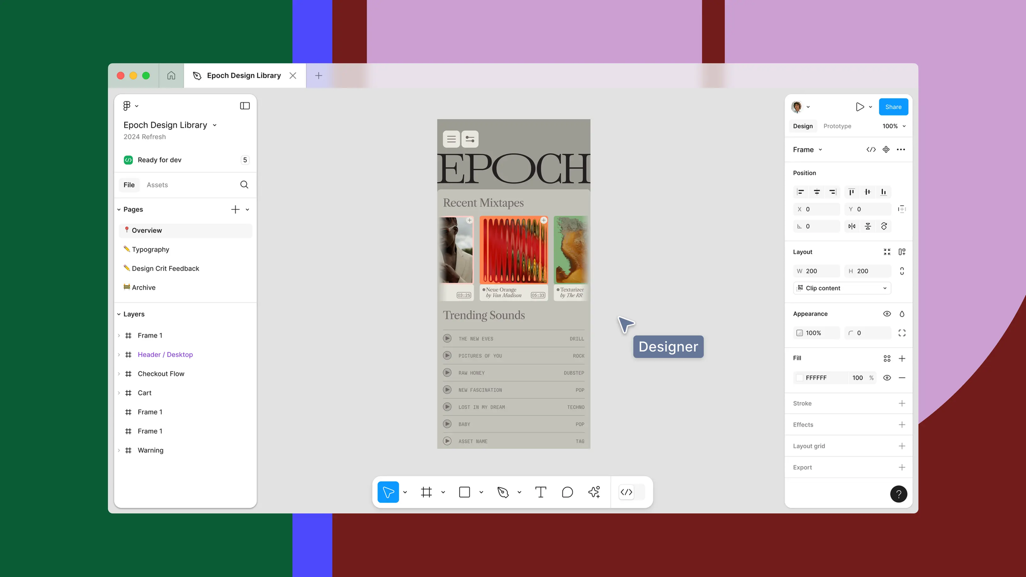
Gone is the dark and full-width top toolbar that had previously served as a defining visual for the design tool, and there are now floating panels with the toolbar’s new position at the bottom of the editor. Although there’s certainly something to say about losing a few valuable pixels on the left and right of the window due to those new floaters, when I’m in Figma now, I do feel as if I’m immersed within the canvas a tad more than I was before. What I’m looking at is the same, but my peripheral of the view feels larger. This visual adjustment and tradeoff doesn’t feel good or bad to me; it’s just a little different!
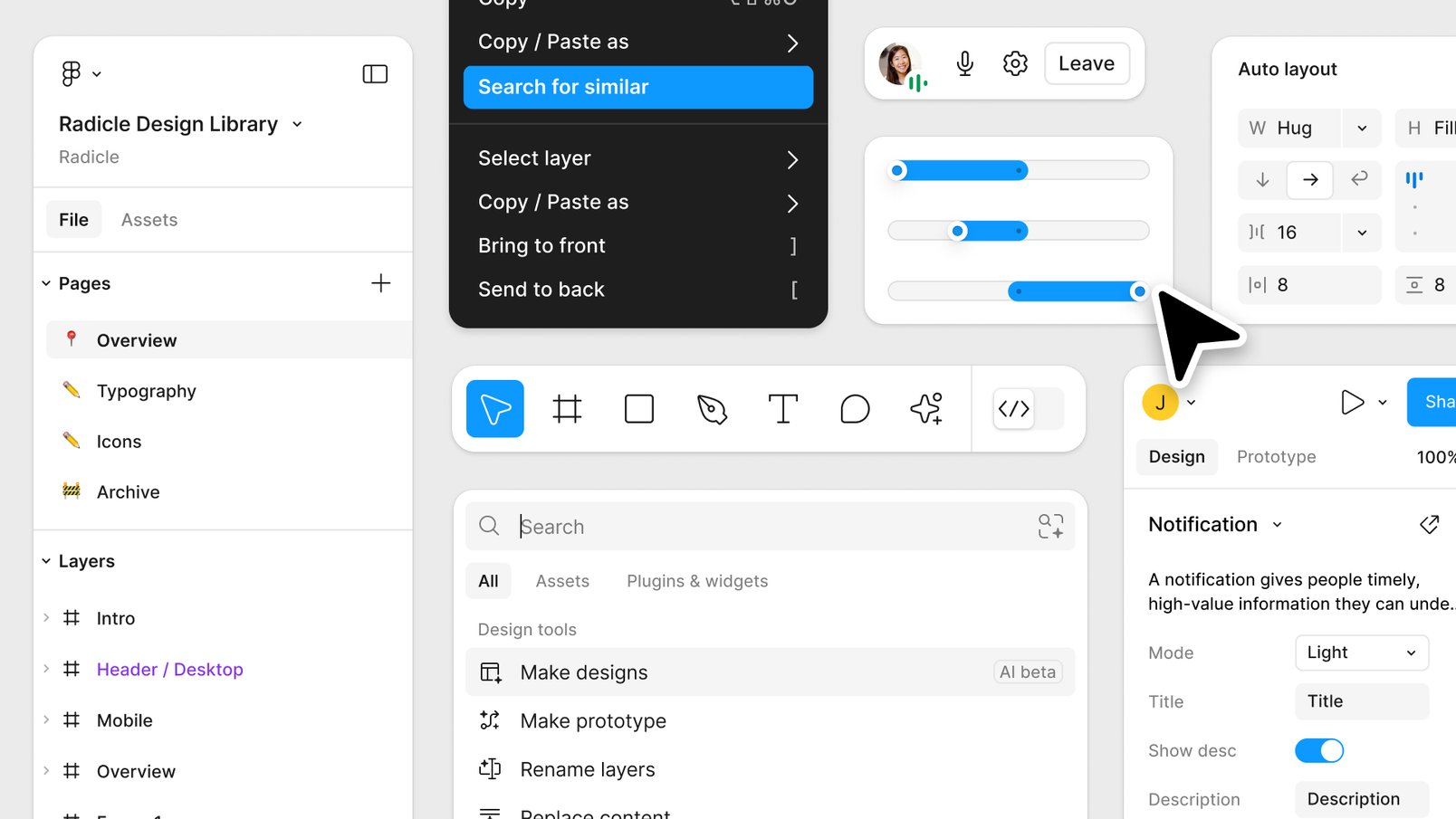
What’s exciting is that UI3 goes far beyond a few new panels. The team redrew every icon and reworked the appearance and positioning for the various controls and inputs within those panels and menus. Affordances for selection and input are far more apparent to my eye, and there’s even a new option to enable Property Labels to help adjust and retrain that muscle memory we all had a little easier.
Tip: Property Labels can be enabled by clicking the dropdown menu next to the zoom percentage and selecting Property labels.
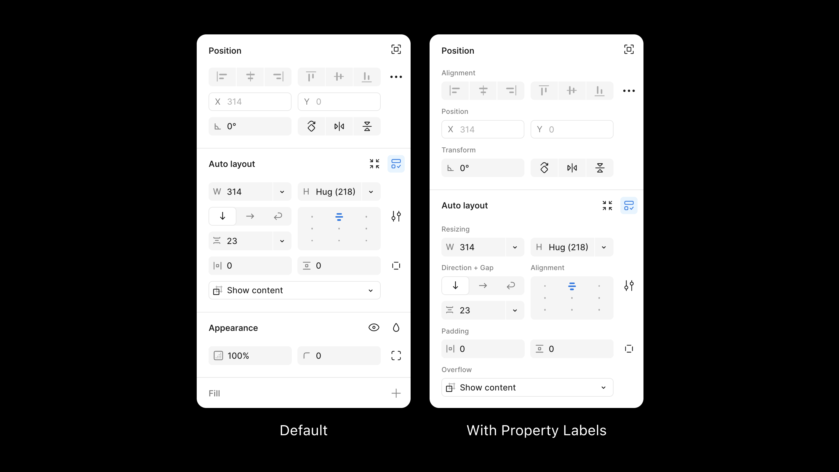
The new visuals extend outside of the editor, too. The Figma file browser and Community landing pages have all received updates to match the latest visual language. However, it’s still very much an incremental update that leaves Figma feeling very much like Figma. Personally, I love the redesign, as it feels like a fresh and modern take on the tool that so many of us spend hours and hours in each week while remaining completely recognizable.
For those working in design systems and everyone using components from libraries within Figma, one of my favorite updates with this refresh is the repositioning of component variants and property controls. These controls are no longer seated halfway down the Property Panel but are now near the top, with more of the component description visible. And because the Property Panel can now resize, meaning its width can finally increase or decrease, it’s much easier to see more of the variant or property label, too! 👏
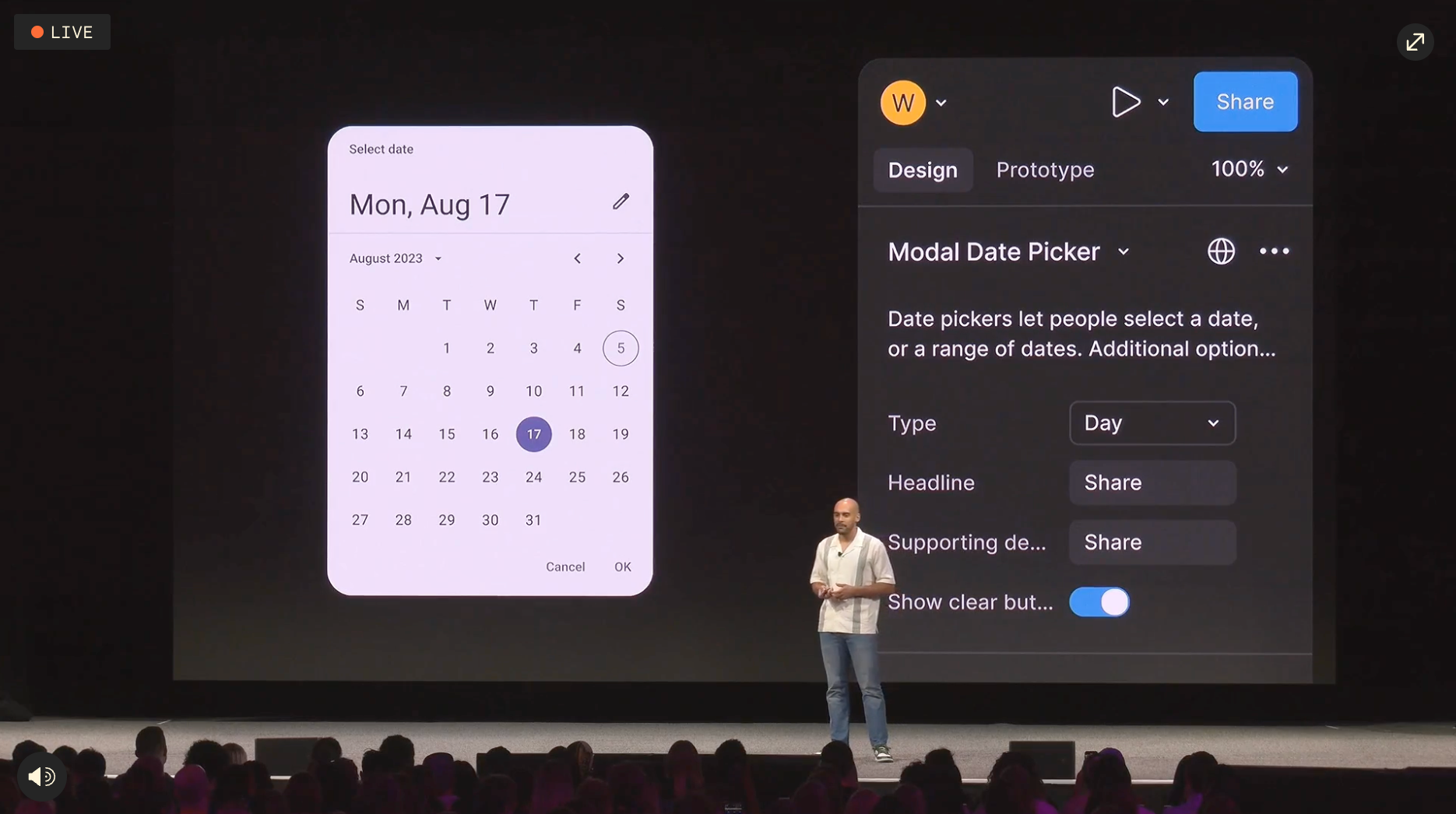
If you don’t have the new UI yet but want to become more familiar with its adjustments and changes, Figma released a detailed resource that outlines how things changed and compares the old with the new. And if you need to switch back to the old interface for a bit, you can do that with an option in the lower right Help Menu.
Figma AI
One thing is certain: the tools we use to create our best work are constantly changing, and Figma received a few significant updates that are certain to help us in our craft, but may also even challenge how we approach our craft entirely. So many of us were expecting some AI-related announcement, as it’s tough to find a product in 2024 that doesn’t use or contain AI in some shape or form, and at Config, AI made its way into the Figma canvas in a few different forms.
Make designs
Figma now includes AI interface generation, which is prompt-driven and limited to mobile and website designs. It’s a curious thing, a design tool creating a tool that creates designs for designers and I believe there will be real implications as this technology continues to improve, not just within Figma but across the industry, but that’s for another post.
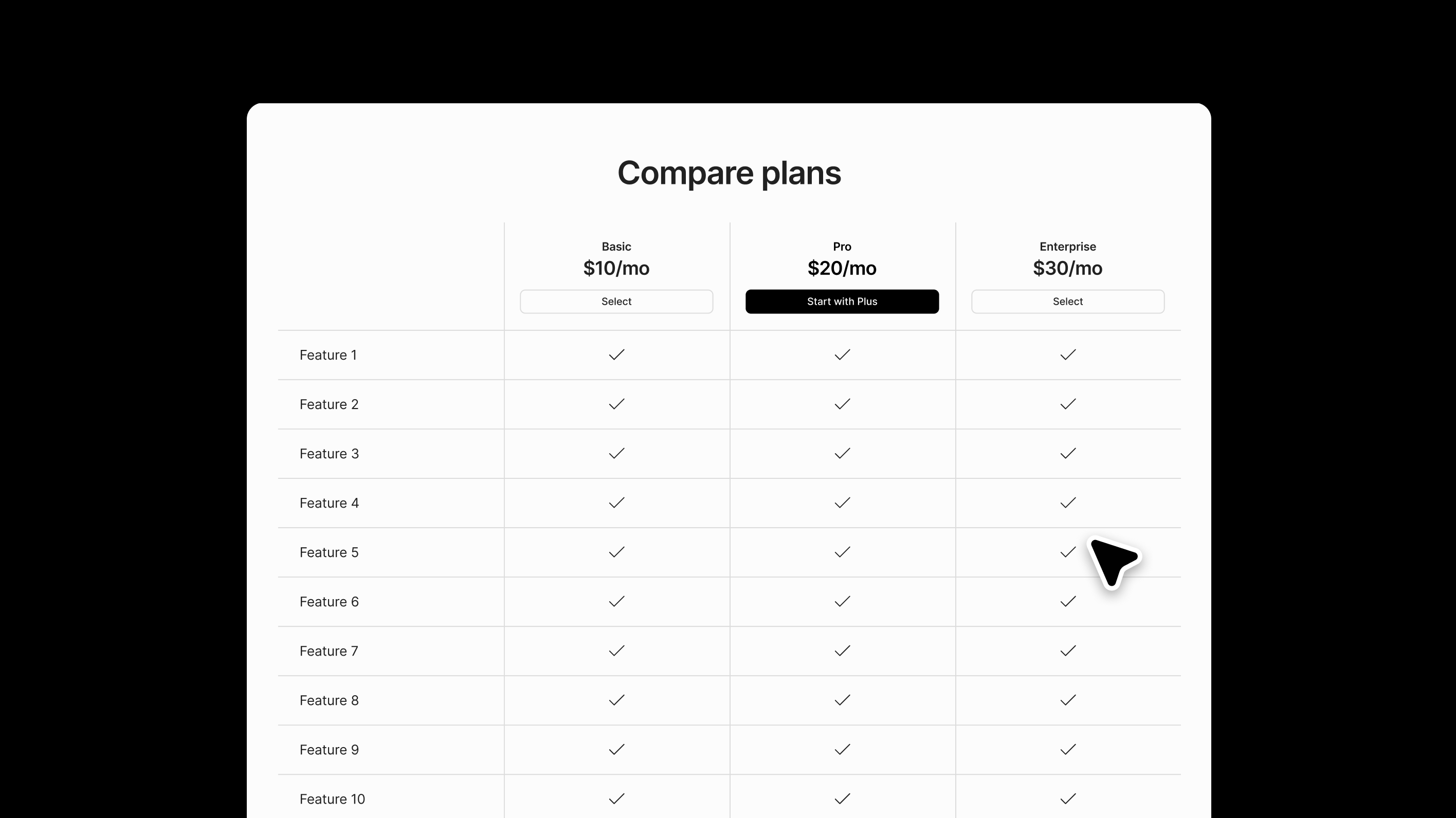
Right now, I think this tool can help the most in quick design generation, which can sometimes be challenging or time-consuming to create, especially for those that might require complex auto layout setups and perhaps you’re unsure where or how to start. I’ve been using Figma for years now, and if you asked me to create a completely responsive table quickly, I’d struggle to know where to begin, even though it’s something I’ve done hundreds of times.
Here’s an example to show you what I mean:
I prompted Figma’s AI to “create a website with a table with several rows and three columns.” Within a few seconds, Figma’s AI came back with a design that, sure enough, had a completely responsive auto layout-based table with 12 rows and three columns. While the content may not be relevant due to my short and vague prompt, I now have a table I can take, modify, and use within the real design. This example of using AI didn’t replace the work I was already going to do, but instead allowed me to get there a bit faster and more efficiently, and to be honest, I’ll never complain about AI creating an auto layout-based table for me.
Find assets and designs
Figma’s new ability to find and locate assets and designs is one of my favorite AI-powered features in the new set. I can’t tell you how many minutes and hours I’ve spent looking for a very particular screen or piece of UI within Figma, only never to find it and then needing to recreate it.
With this new feature, now when using Figma, we can search in two ways:
- Search for similar
- Search within the assets tab
Searching for similar allows for searching through descriptive prompts, an uploaded image, or even a canvas selection (including drawings with the Pencil Tool. ✏️) I have such a tough time remembering exact file names, but what I can do is easily recall text that appeared within a design. Thanks to this feature, we can now search for that, too.
Also included here is an upgraded experience for locating component instances within the Assets panel. Figma can now use AI to understand the semantic meaning behind a query and no longer requires a matching component name or relevant description to find the item you’re looking for. For all of the design system designers out there, I’m sure you can share my joy in this update! Anything that makes the lives of those relying on the system and libraries we build is a huge win.
Replace Content
With improved search and the ability to make designs (it still feels quite strange to type that), Figma’s AI can help us translate, shorten, or rewrite text within a design. And if that weren’t enough, these AI content generation models can help us populate content within a design, reducing the need for lorem ipsum or copy that just doesn’t quite make sense.
I populated each name with Figma's Replace Content Tool in the design below, and with any auto layout group with repeating frames inside, the Replace Content tool can run. I did try to make a change, asking to place them in alphabetical order based on their last name. This query worked several times but failed a few times, which is to be expected here and there.
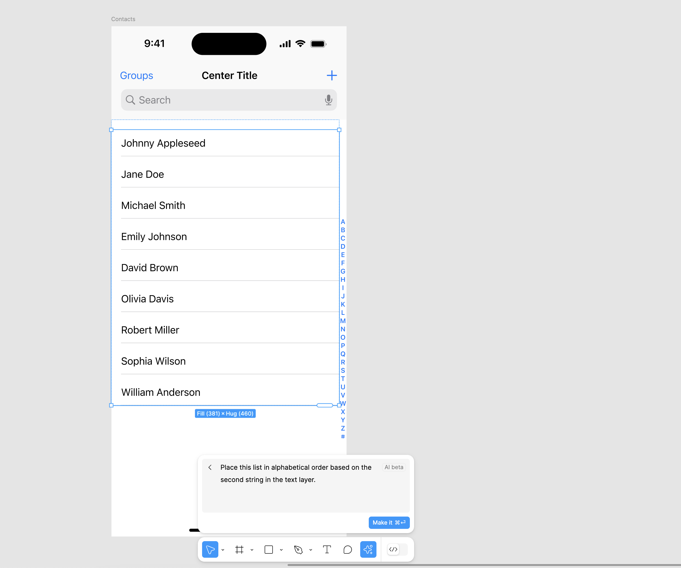
In no way will this replace the talented content designers we work with, but in my experience, this tool makes the task of populating mockups much easier and helps to get a few initial ideas going for a prototyped flow.
Naming layers
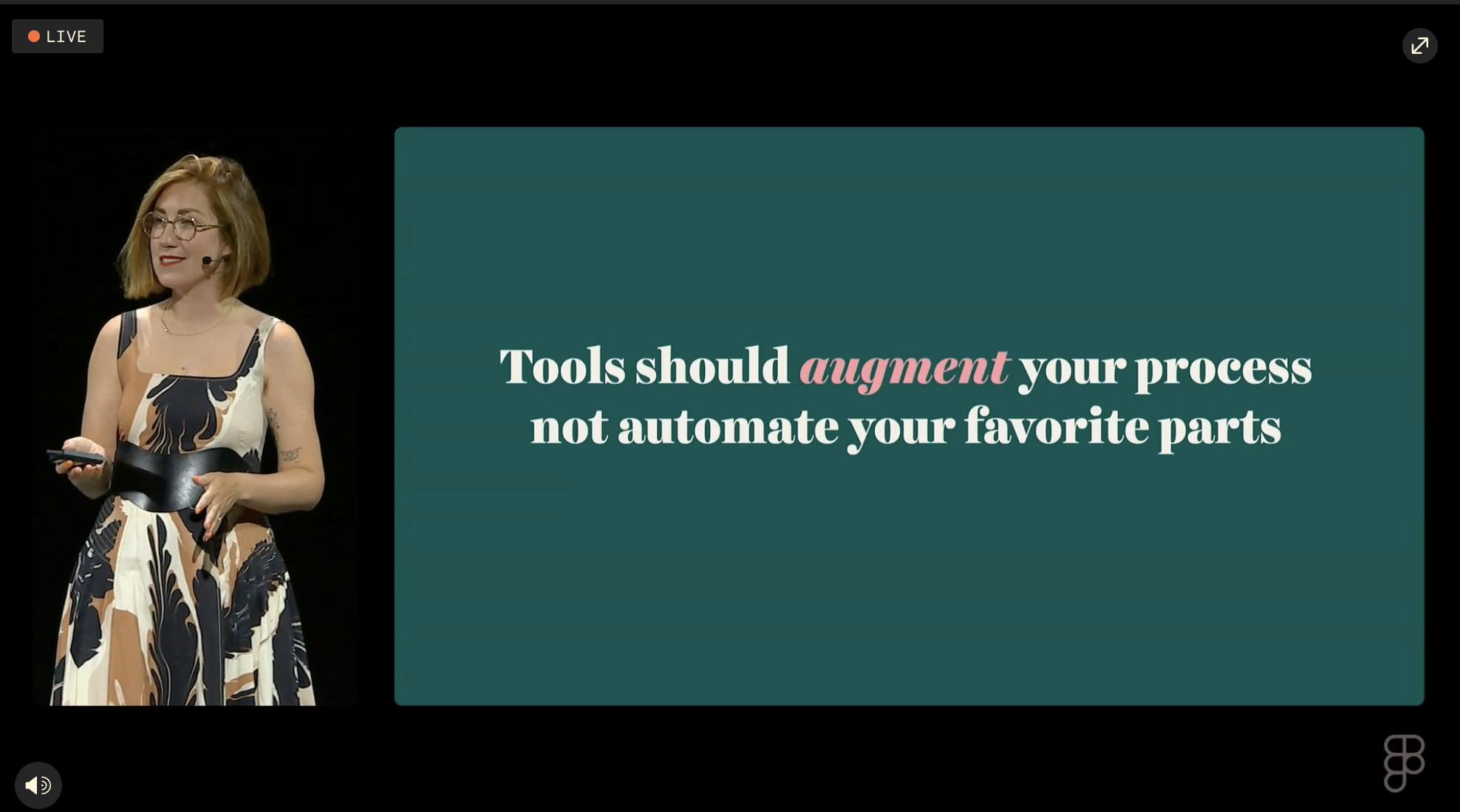
Hey, the debate on whether or not we should be naming our layers may finally be over because AI can now do that for us, too! In her 2024 Config talk “Lost Found in the Details”, Jessica Hische had a slide that said, “Tools should augment your process, not automate your favorite parts” and I can say that for as much as I believe layers in a file that other people may use should be named, I never enjoyed the process of naming those layers. To me, this is the perfect application of AI: taking on a tedious task that you may not enjoy doing and doing it well.
Figma Slides
Without a doubt, the show's star was Mihika Kapoor, and the introduction of Figma Slides, a product announcement that took so many of us by complete surprise, yet it makes perfect sense. Whenever I’ve been tasked with creating a deck, whether for a company presentation or portfolio piece, I’ve always used Figma. And not necessarily because it was the best presentation tool out there (we were all missing our speaker notes here) but because I felt I could create something I was proud of within Figma. I won’t mention other tools, but my goodness, has it been challenging to make a presentation that uses custom fonts and colors in 2024.
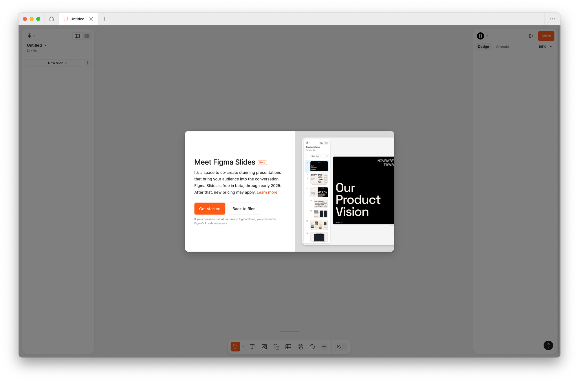
I can only imagine the product, design, and engineering feat it took to make this product, and it feels like the team took every opportunity they could to go above and beyond what they needed to do. Here are some of my favorite details about the tool that have been shared to show what I mean:
- Prototypes can be directly embedded into a slide, meaning those following along can interact with the design right on the slide.
- Polls and alignment scales are part of Slides, making it possible to capture audience feedback as the presentation is shared.
- Design mode can be enabled to access the full power of Figma right in Figma Slides, which means features like auto layout, advanced properties, and detailed vector editing can all happen where you’re making the slide.
- Components and styles from your libraries can be used directly within Slides, which means everything stays up-to-date and consistent.
- Figma’s AI initiative made its way here, too, to help adjust text within slides. What’s super interesting here is a feature named Adjust Tone, which allows you to dial in a combination of language tones, including brevity. We’ve seen this interface used in products such as Arc or in tools like GarageBand for some time now, and it’s fascinating to see this pattern used to control the AI’s generated output.
Dev Mode
It’s been a big year for Figma’s Dev Mode, a product feature that helps close the gap between design and development. At Framework by Figma, a virtual conference that happened a few months back, Figma announced Code Connect, allowing us to bring design system code directly into Figma, and here at Config, Dev Mode received even more updates.
Even for those who use Figma all day, the interface and where things are can sometimes be overwhelming. I can only imagine how developers felt even with Dev Mode being available. To help developers filter down and find what they need to see, the team shared a new Ready for Dev View available, which reminds me a little bit of Facebook’s Pixelcloud (does this still exist?)
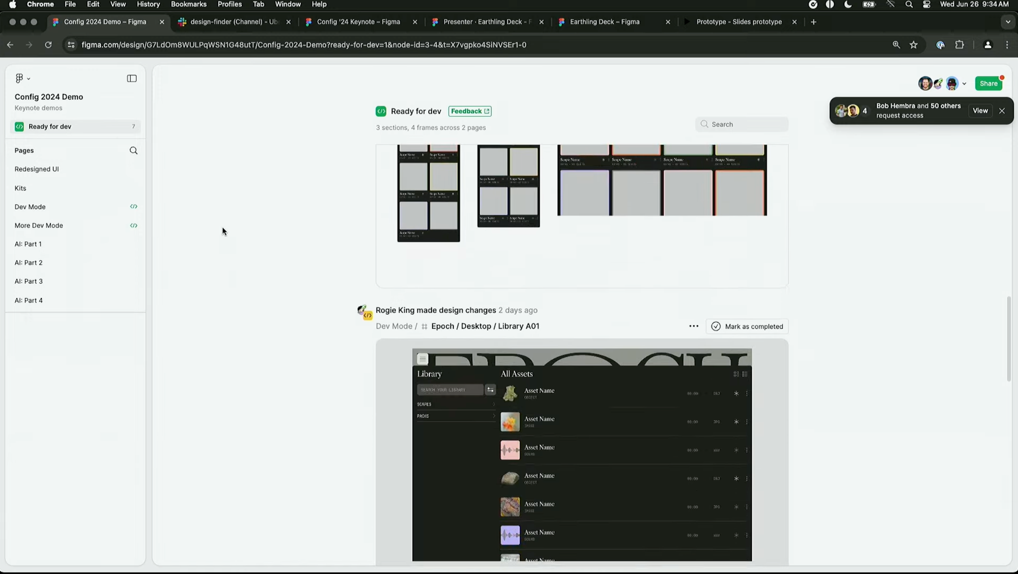
Developers can also now view prototypes in a responsive view, allowing those inspecting to see how the design reshapes and resizes based on the screen’s width. When I first heard Figma mention this, my first thought was in hoping that this feature would come to Prototyping by default, and we now know that it does! When you’re in a prototype, tap Responsive within the prototype settings menu.
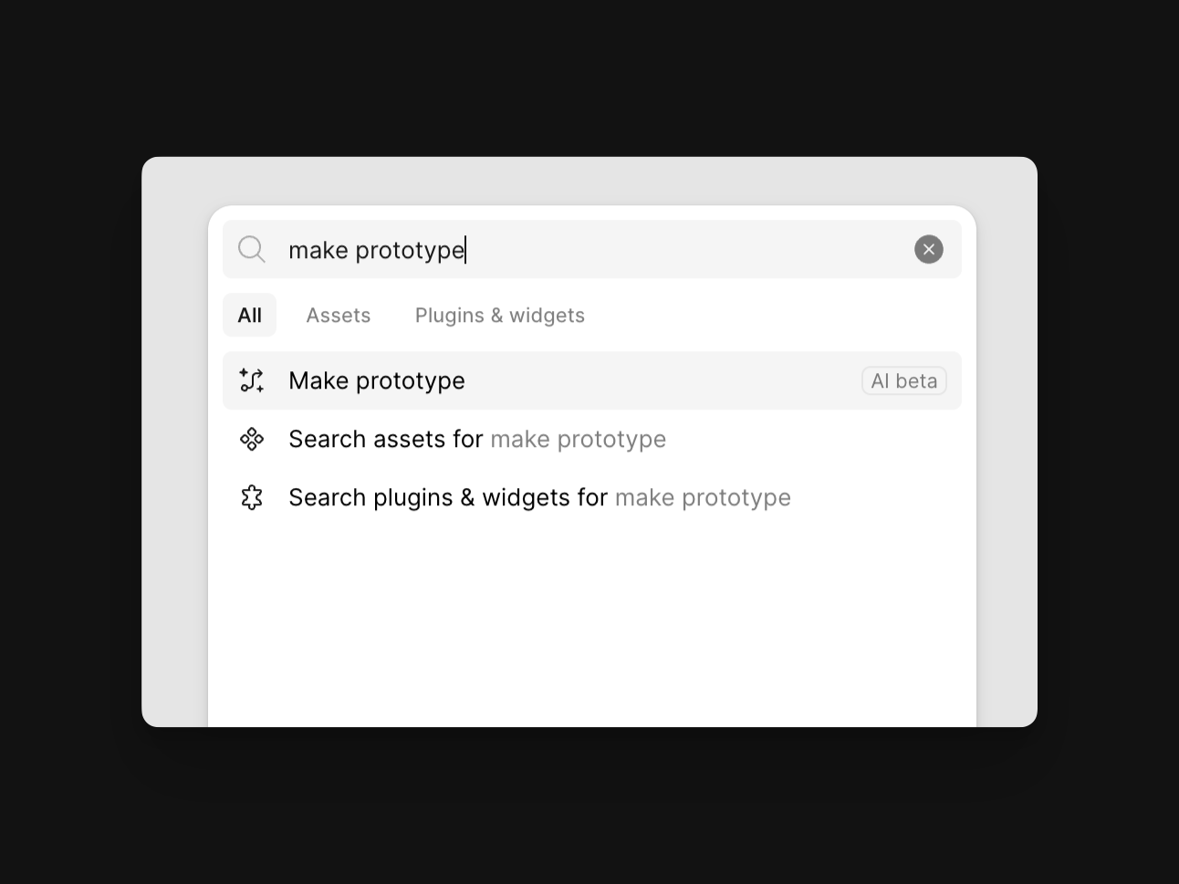
Speaking of prototypes, Figma’s AI can now help create those connections, too! By selecting a series of frames within a page's canvas, running the Make prototype action now generates connections between those frames, and it seems to do a pretty great job, too! In my experience of playing around so far, I’d say that for more basic designs, it helps to get you at least halfway there, and it will even go so far as to create back actions whenever a left-facing chevron or back text is detected.
More updates
Making sharing easier
For agencies and freelancers (hey, that’s me now!), Figma should begin to work a lot better for many of our workflows soon. A significant update that the team shared is that different Figma workspaces will soon be able to connect so that we can easily collaborate with those at other companies or teams. This feature sounds a lot like Slack Connect, and although it’s not out just yet, I can’t wait for it to arrive.
In addition to joining other teams’ workspaces, projects that are within any plan of Figma will soon be able to be transferred from one individual or team to another. Today, many of us are downloading and sending local .fig files (CMD + / + “local copy”) or inviting others to our projects, which is tough as it can add unnecessary costs to smaller agencies and individuals.
Auto Layout
Auto Layout received a few updates, too! One of the most challenging problems with Auto Layout is assembling the layer structure correctly to get everything working and feeling responsive. To help, Figma can now suggest when multiple frames of Auto Layout may be necessary and can create those frames for you using the new keyboard shortcut CTRL + Shift + A. And if you’re placing an object inside a container that uses Auto Layout, holding CTRL now ignores the layout tool and sets absolute positioning.
Even more, Auto Layout now prioritizes Fill by default, and we can even set an item to Fill by just resizing its width. Figma’s Auto Layout has always made assumptions about the layout we were trying to create, and with this update, those assumptions and suggestion appear to be much more accurate. I’m so happy this update is here, and for a great demo that visualizes all of the new updates, check out the posts that Jackie Chui at Figma created.
Libraries
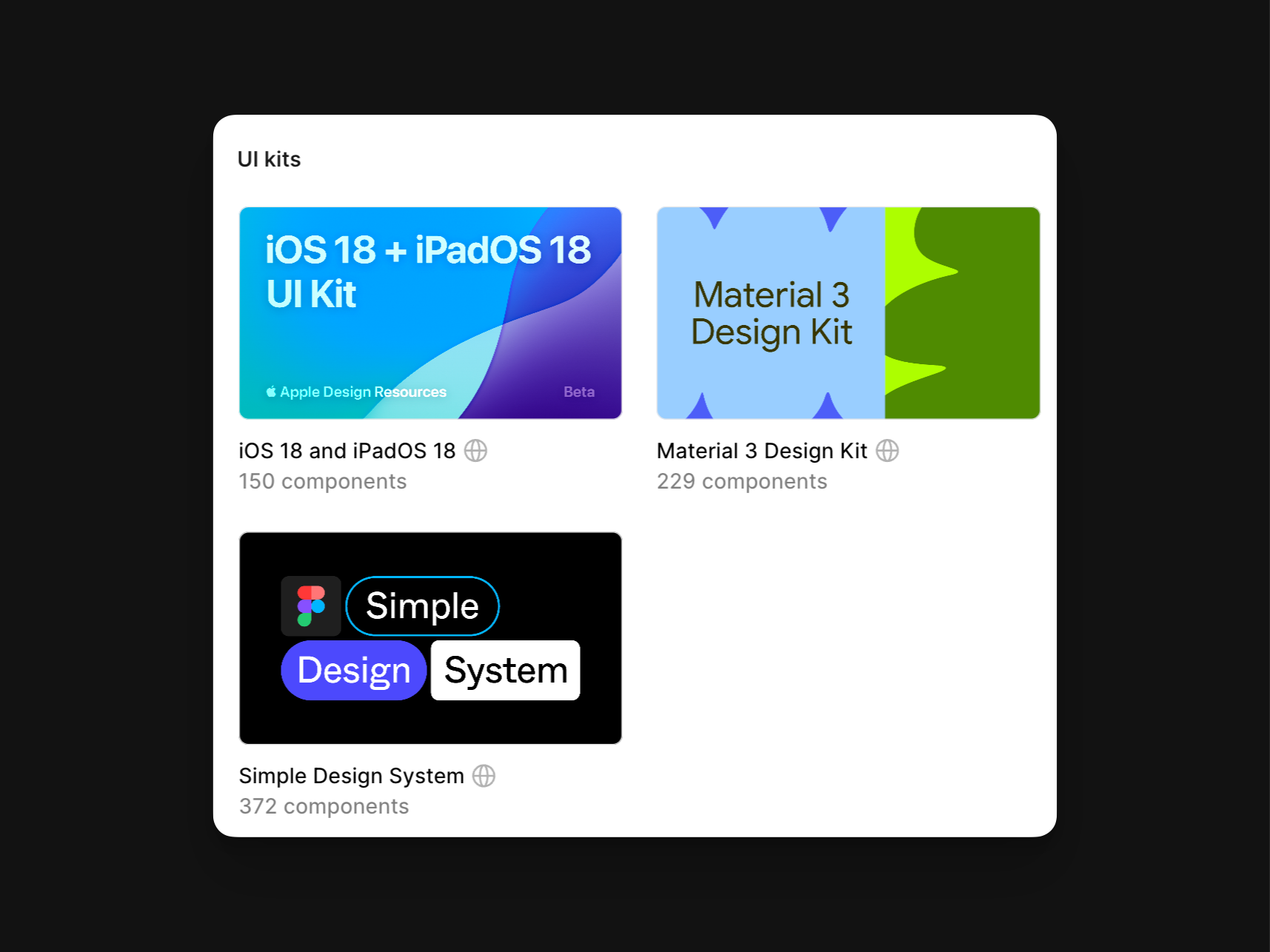
Component libraries from Apple, Google, and even Figma have finally made their way into Figma by default. As many of you may know, I worked on many of the unofficial iOS UI kits for Figma for years. It was always a dream of mine to see kits like the ones I was creating to be offered by default for anyone using the tool and wanting to make more accurate designs for the world’s most popular platforms. I can only imagine what a feat of work this was for both the Figma team and those at Apple and Google, and I am so happy this exists now. Huge congrats to those teams!
What wasn’t announced
Although we received so many updates and even an entirely new product from Figma at this year’s conference, there were also a few things that we didn’t see. When it comes to continuously shipping updates, though, it’s hard to beat this team (see Little Big Updates, where 42 updates were shipped in two months), and I’m hopeful that with the introduction of UI3, there’s even more coming soon!
Here’s my shortlist wishlist (and I’d love to know yours!):
- The ability to reorder variable modes (variable table columns).
- The introduction of component slots, making instances easier to work with for designers.
- Editable text fields within prototypes.
- To have AI’s help with creating component properties (automatically mapping boolean values) and writing component descriptions.
- The ability to better create and export motion within prototypes for others to reference.
In case you missed it...

I teach a course called Level Up with Figma that’s had just over 800 students pass through, and with all of these updates from Figma this past week, I’m excited to share that I’m rebuilding and re-recording every module to share all that’s new with you.
This course has nearly 40 modules that contain everything I know about Figma, with all of the shortcuts and tips I use daily to design and create libraries within the design tool.
If you or your team want to join the August cohort, use the code earlybird for 25% off enrollment! I’d love to have you there.
Recent bookmarks
- The original pitch deck for Diagram (acquired by Figma) from Jordan Singer.
- Understanding UI density in design by Matthew Ström.
- On fighting creative burnout from Jessica Hische.
Say hello!
I always love hearing from people, and if you enjoyed this, please reach out! You can find me on Threads @joeyabanks.


