Baseline #25 – Using Auto Layout in Figma
Hello again! 👋 In this week’s newsletter, I’d love to dive into one of my favorite topics with you: creating responsive and robust components within Figma. For the past eight years of my design career, I’ve spent most of my time working in Figma, partnering with designers and engineers to create components and establish patterns that help push the product forward and mirror or elevate what’s shown in production.
Within this work, many moments feel incredibly rewarding and satisfying, from hitting publish on the new library file to seeing a component that once only existed in Figma live in the app. But above all, I genuinely love when designers can feel more confident in their work through the use of the system. A design system’s goal shouldn’t ever be to restrict or reduce creativity and exploration but rather to help bundle up all of the team’s decisions and patterns for others to use to do their best work; that’s what I enjoy most.
Creating a component in Figma is relatively easy. However, building a component that works well in various situations and for different screen widths and heights using tools like constraints and auto layout can be more challenging and intimidating. Let’s first talk about those tools and how they work within Figma, and I’ll share the techniques and practices that have helped me ensure I’m building reliable components for those depending on the system.
Creating Responsive Components
Frames
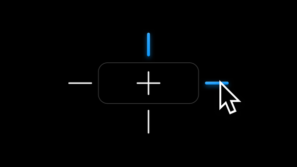
Within Figma, we can use two main tools to build responsive and flexible components: constraints and auto layout. Constraints allow us to determine the behavior of a selected item should its parent container ever resize. Auto layout, however, is a tool we can apply to a container that allows it to resize based on the content within.
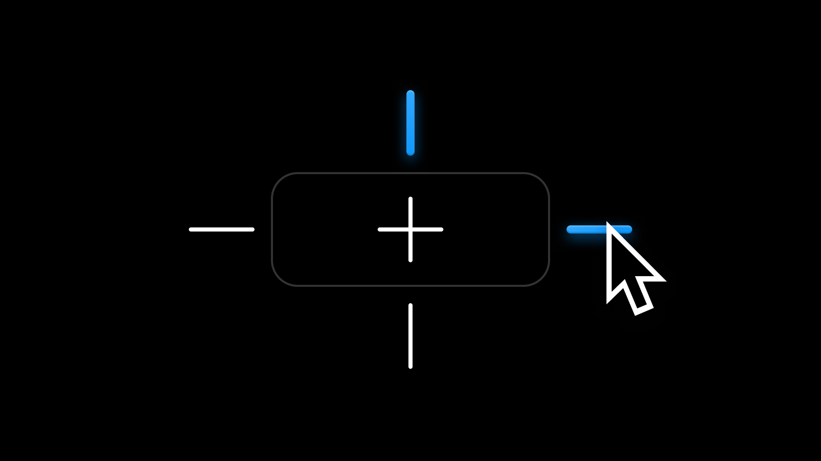
Auto Layout
Just as we’re able to use constraints to set the behavior for items within a component if the component were to ever grow or shrink, we can use auto layout to define what happens to the size of the component itself if content is ever added or removed and how that content resizes within the frame.
Auto layout is useful throughout design system components, such as buttons or inputs, or really, within any component that we expect to be modified by the designer using it within their work. Auto layout allows the component’s content to be adjusted while maintaining set spacing, padding, and resizing properties. As we think about building scalable and robust components for others on our team, using auto layout is essential and an incredible tool available within Figma.
But for as wonderful as auto layout is, the layout tool can often feel daunting for many designers, including myself. Using auto layout requires a lot of upfront thought about how a frame or component should behave, and we may not even notice that something doesn't work as expected until someone on our team tries to use it within their design.
I’d love to share a few techniques I’ve discovered and use when building responsive components with the feature, and I hope these tips can help as you make your library of components. But first, it may be helpful to share more about the various layout options available when using the tool.
Fixed
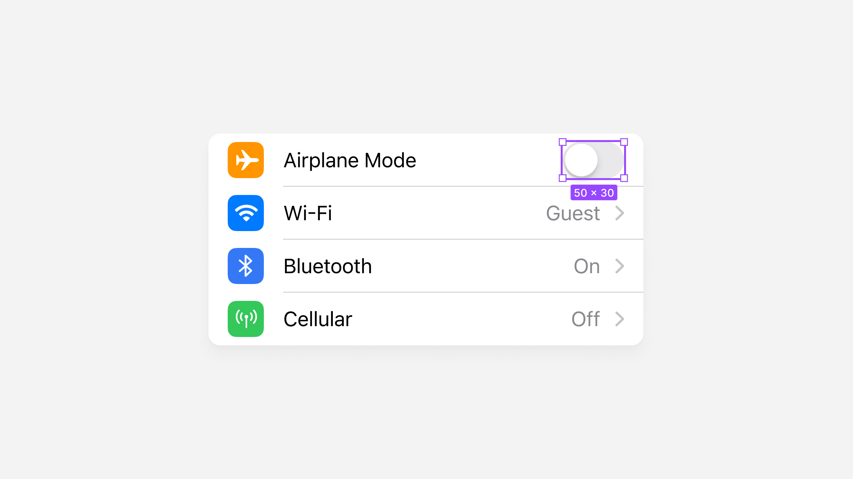
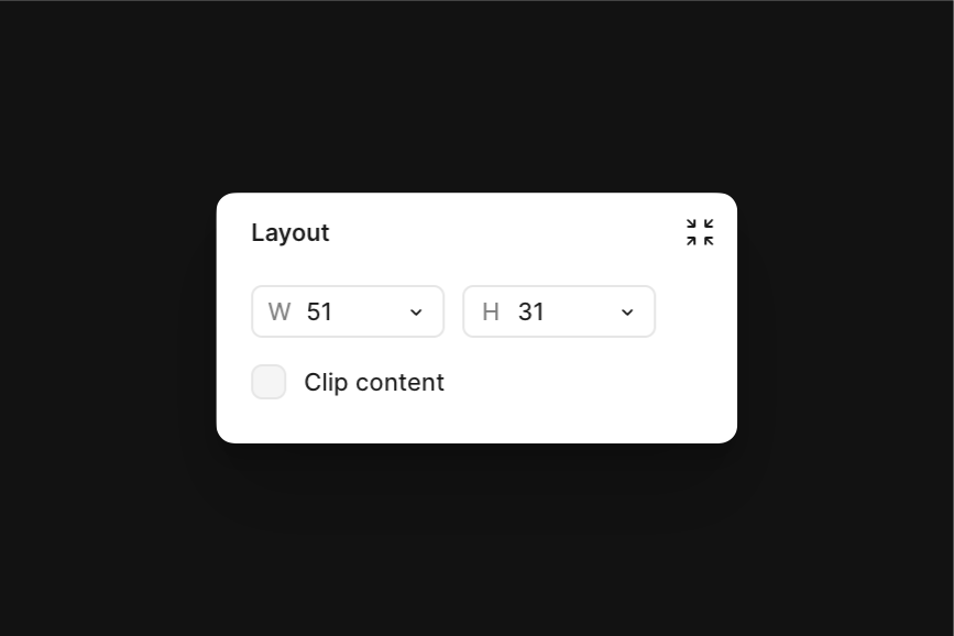
When we set a layer’s sizing to Fixed, its size will remain the same, regardless of how its parent container and the content within change. We’ll want to apply fixed resizing options for any item within a design where the size should never change, such as the Toggle in this iOS Table Row. If the width or height of this Table Row ever changes due to the content within, our Toggle's size will remain the same.
Fixed.Fill
By setting a layer’s sizing option to Fill, the layer can fill the container, similar to water filling the volume of a container. In the example below, where the Table Row’s label width is set to Fill, our text will fill the container right up to the edge of our Toggle.
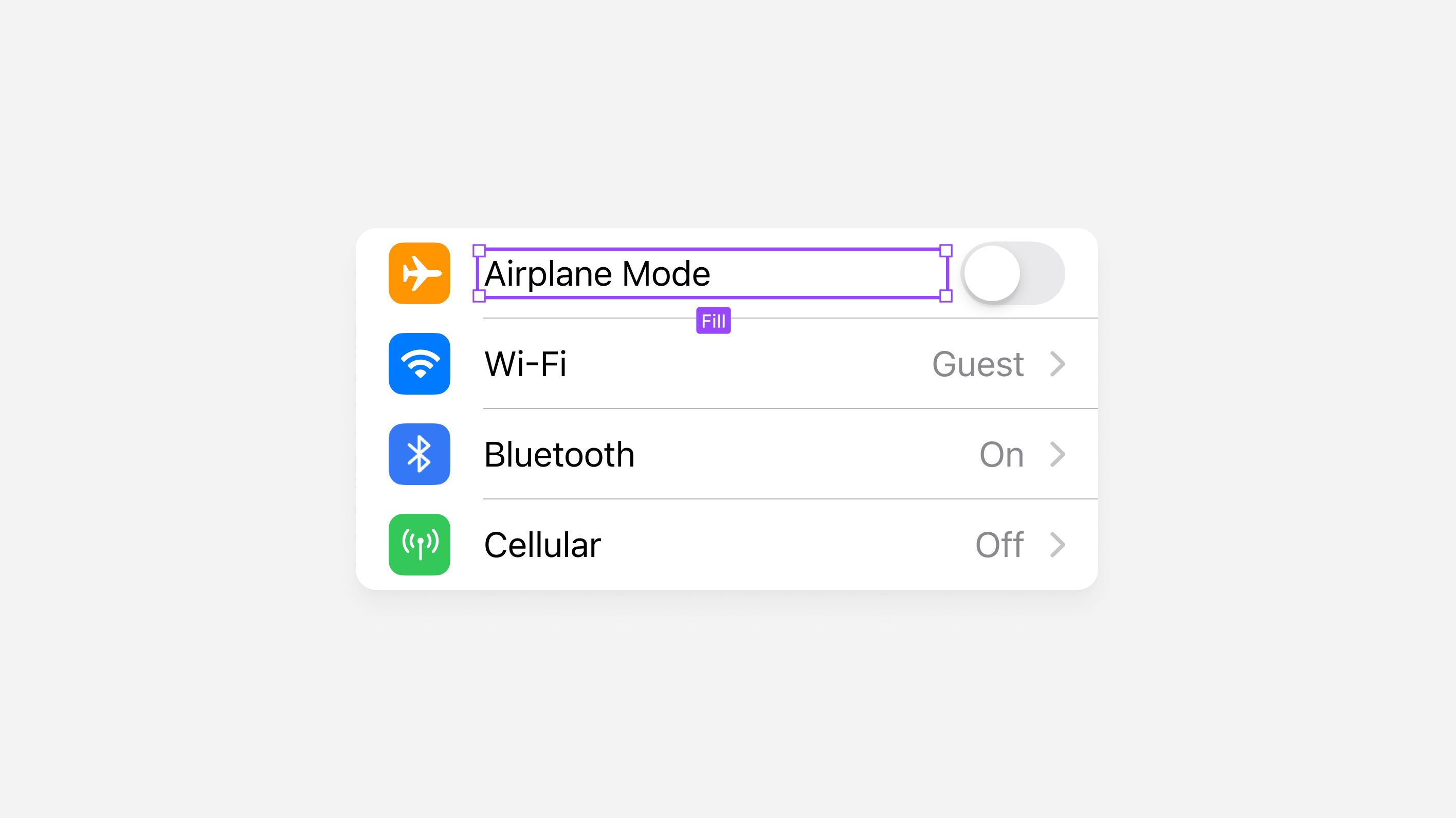
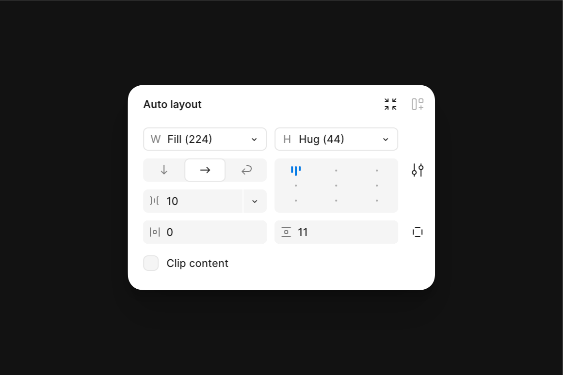
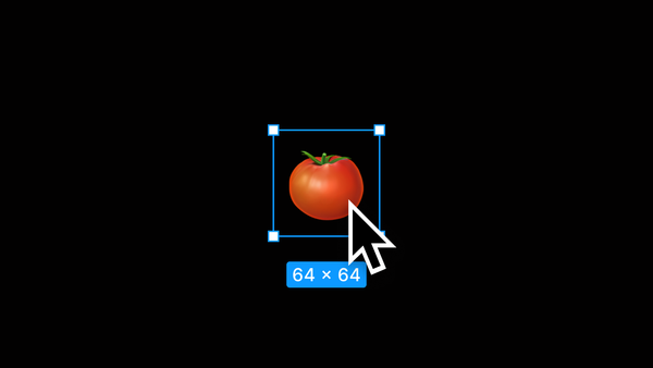
Fill by double-clicking on either the top or side of a frame’s selection bounds while holding the ⌥ Option key. (Just make sure the container it's in has auto layout applied!)Hug
This is another silly way to think about this here, but I promise it helps! I imagine the Hug resizing property as if we were hugging a balloon. If a balloon in our arms were to inflate, our hug would grow! But if the balloon’s air escaped, our hug would shrink.
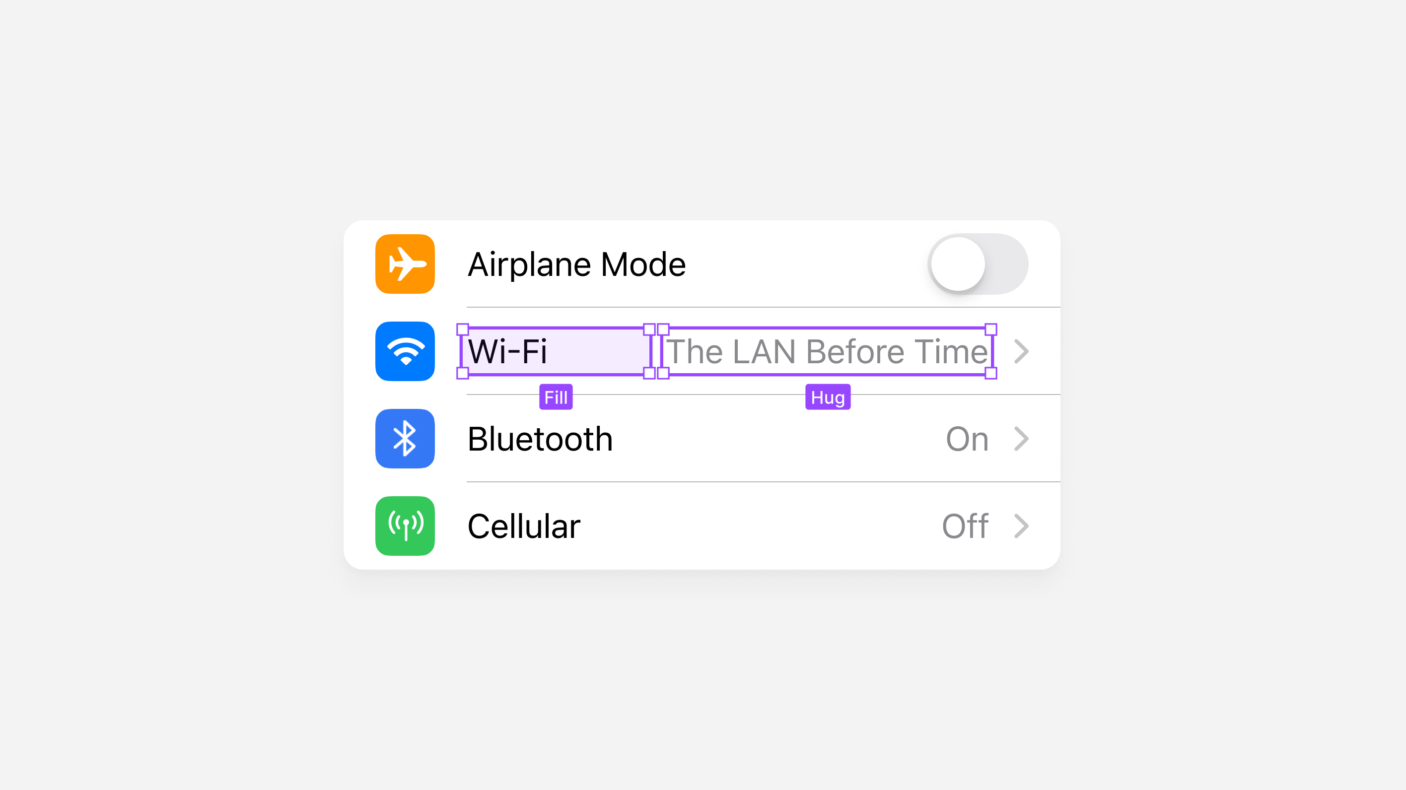
When we set our resizing option to Hug within Figma, the layer’s size will either grow or shrink, depending on the content's size. In the example below, the text layer's space depends on how long this secondary label is.
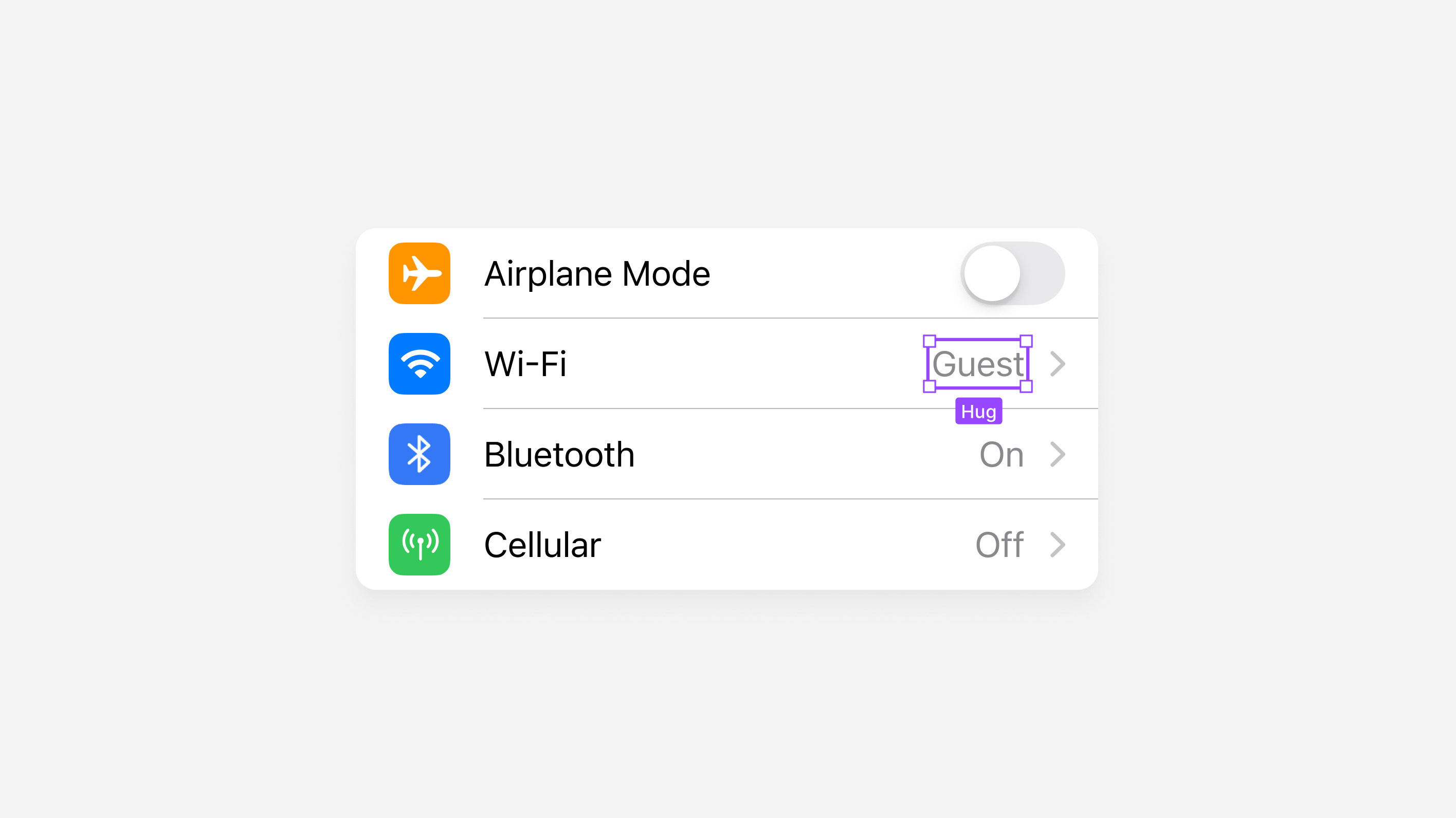
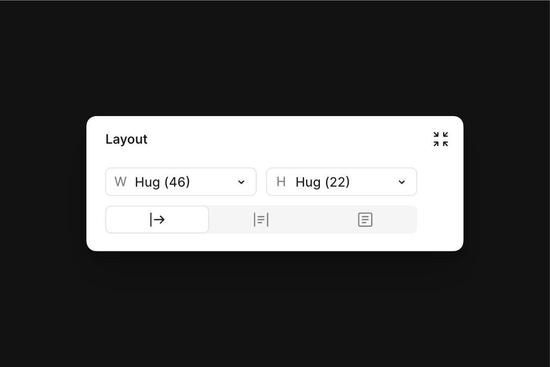
Hug by double-clicking on either the top or side of a frame’s selection bounds.I set this text layer’s width to Hug because if it were to resize, I want to ensure that the primary label, in this case, “Wi-Fi,” which is set to Fill, can only occupy the remaining available space.
Applying Auto Layout
Without a doubt, auto layout is an incredible tool, but for many designers, including myself, it can sometimes feel frustrating to work with and to know for certain that you’re making the right layout adjustments and decisions for how the component may be used.
While Figma does provide on-canvas hints when hovering over resizing options within the Properties Panel, such as fixed, fill, and hug, we’re not able to see the eventual outcome of our decisions and it’s often tough to know where to start when debugging when something goes wrong.
When I was first getting started with auto layout, I remember building a component with the feature, thinking I did had applied everything correctly, only to watch it break when used within an actual design. Does this sound familiar to you? My workflow would look like this:
Step 1: Design and create a component
For me, the first step was always to create the interface I needed and turn it into a component (⌘ Command, ⌥ Option, K), readying the design for either myself or another designer to use within a design.
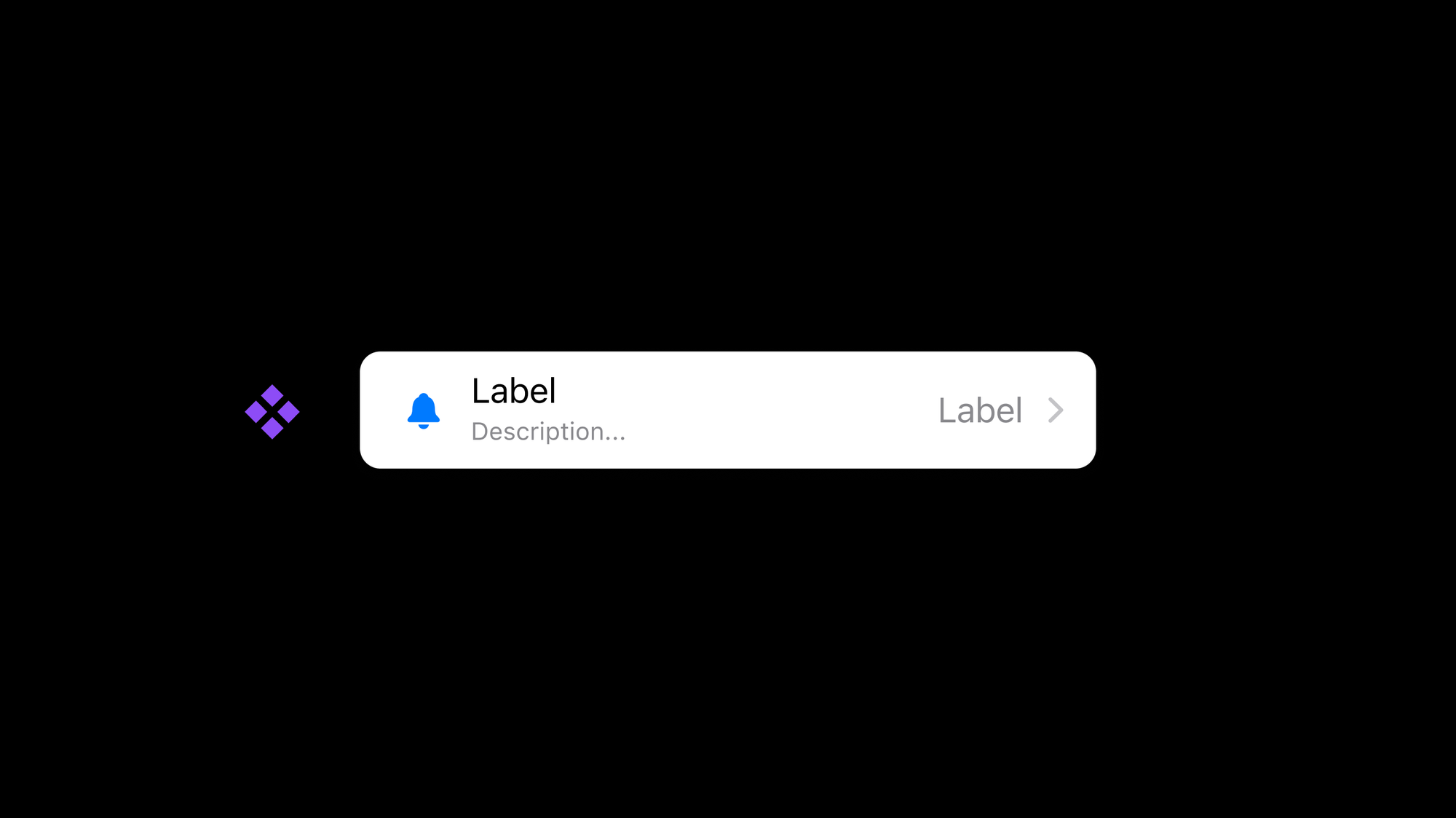
Step 2: Add Auto Layout and make adjustments
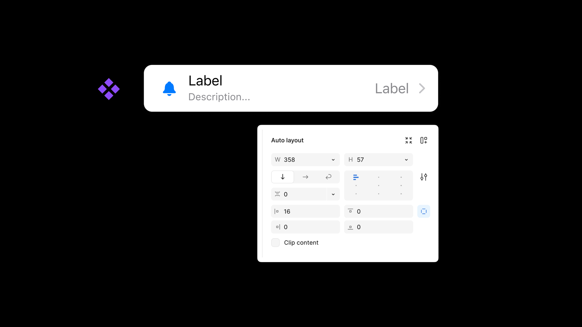
Knowing that the interface, in this case, a TableRow Cell from iOS, needed to be responsive with the device, I’d then add auto layout. Content within the component would often shift around during this step. However, after a bit of tinkering, I was generally able to select the correct settings to get the component to look as expected.
Step 3: Use an instance
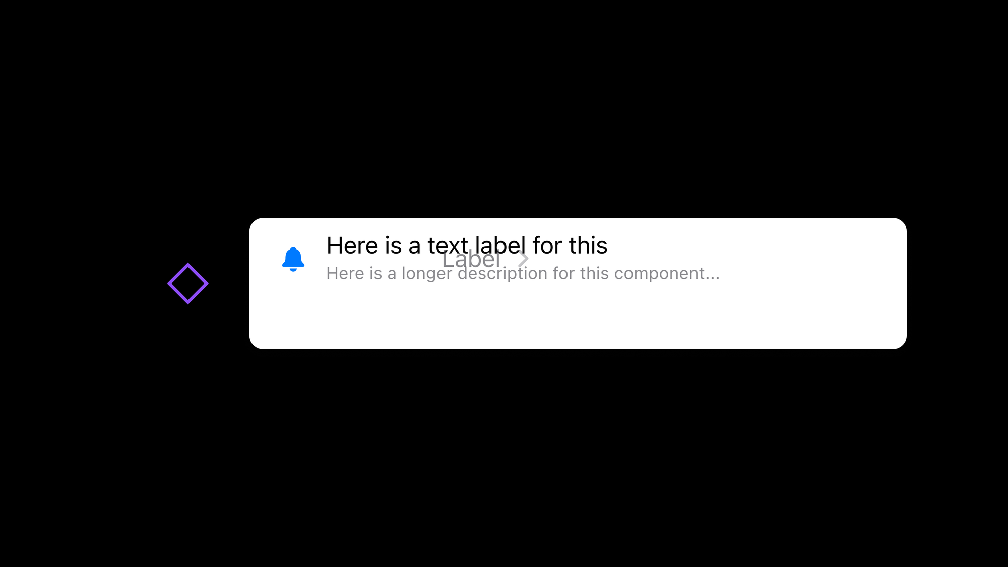
Next, I finally felt ready to use an instance of the component I had just created! Except, this is where things would break as soon as I added in the appropriate content or adjusted its size. In this case, I would have expected the content to remain centered within the container, regardless of the height, for the text to fill the container, and for the label and caret to always remain at the right-most side.
This quickly led to step 4: overwhelm.
Applying Auto Layout: The New Way ✨
When I think about my original way of applying and working with auto layout compared to my approach today, there’s one critically different thing: the order in which I begin to test the results of applying auto layout.
I’d previously waited until the very end to see if the component’s layer structure and auto layout settings were working correctly, and if not, I felt like I needed to go back to square one to start over. With my approach today, I first like to generate an unfinished component instance and stretch it in bizarre and unexpected ways to see what happens. If I can make this component work as expected in the strangest sizes, I’ll feel confident that it’ll work for nearly all situations. To highlight all of this a bit more, here’s how that approach looks:
Step 1: Without finishing the design, create a component
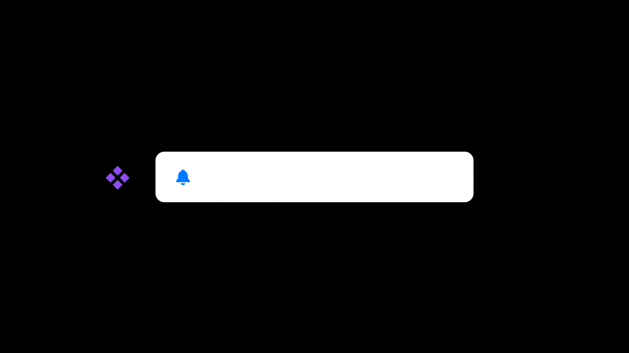
Thinking back to the TableView Cell component, I’ll first create the frame, maybe adding a piece or two of content, and then almost immediately make a component (⌘ Command, ⌥ Option, K) out of the unfinished design.
Step 2: Create an instance of the unfinished component
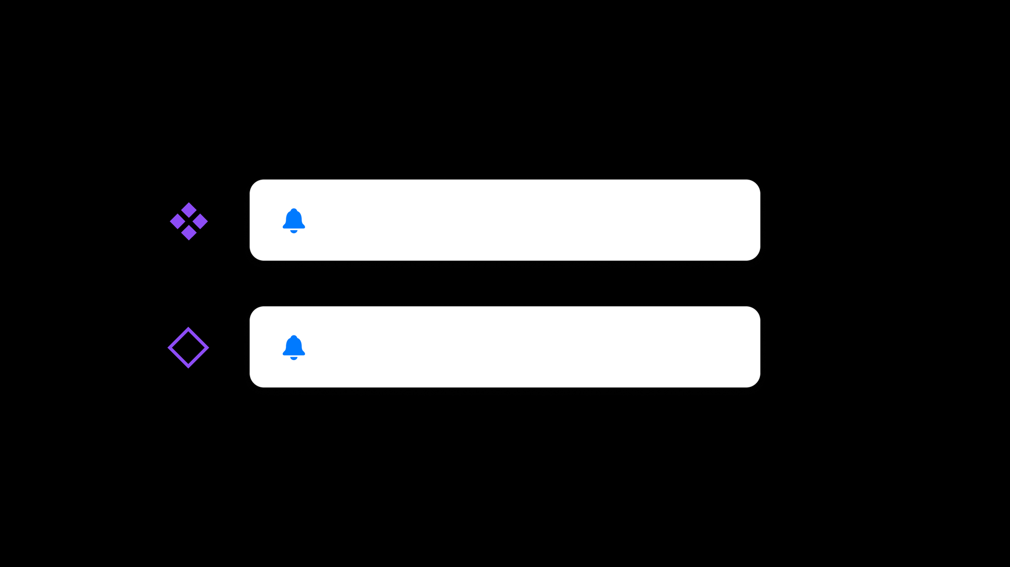
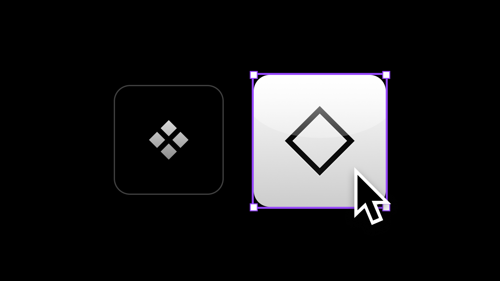
With that component created, the next step I’ll take is to make an instance from the unfinished component, which can be done by holding ⌥ Option and dragging.
Step 3: stretch and resize the component
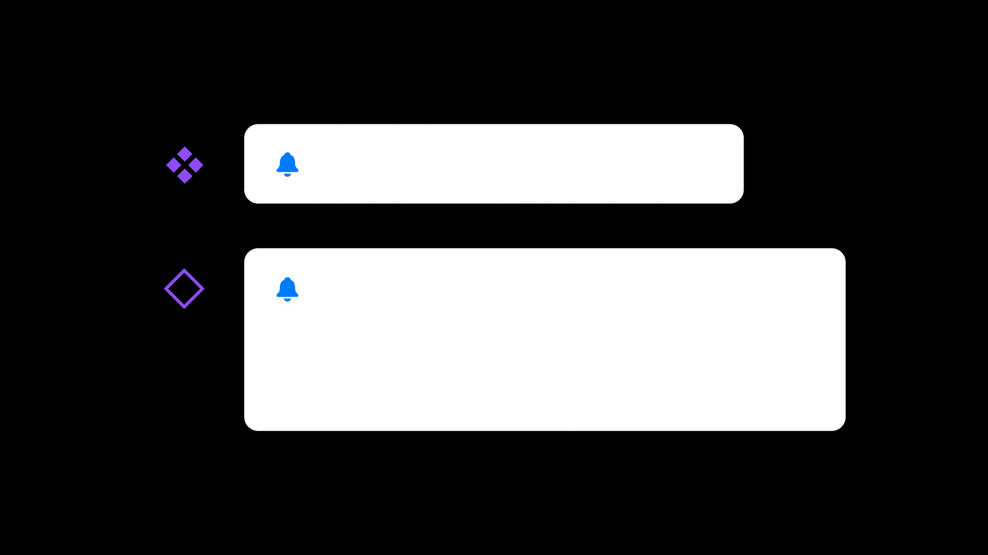
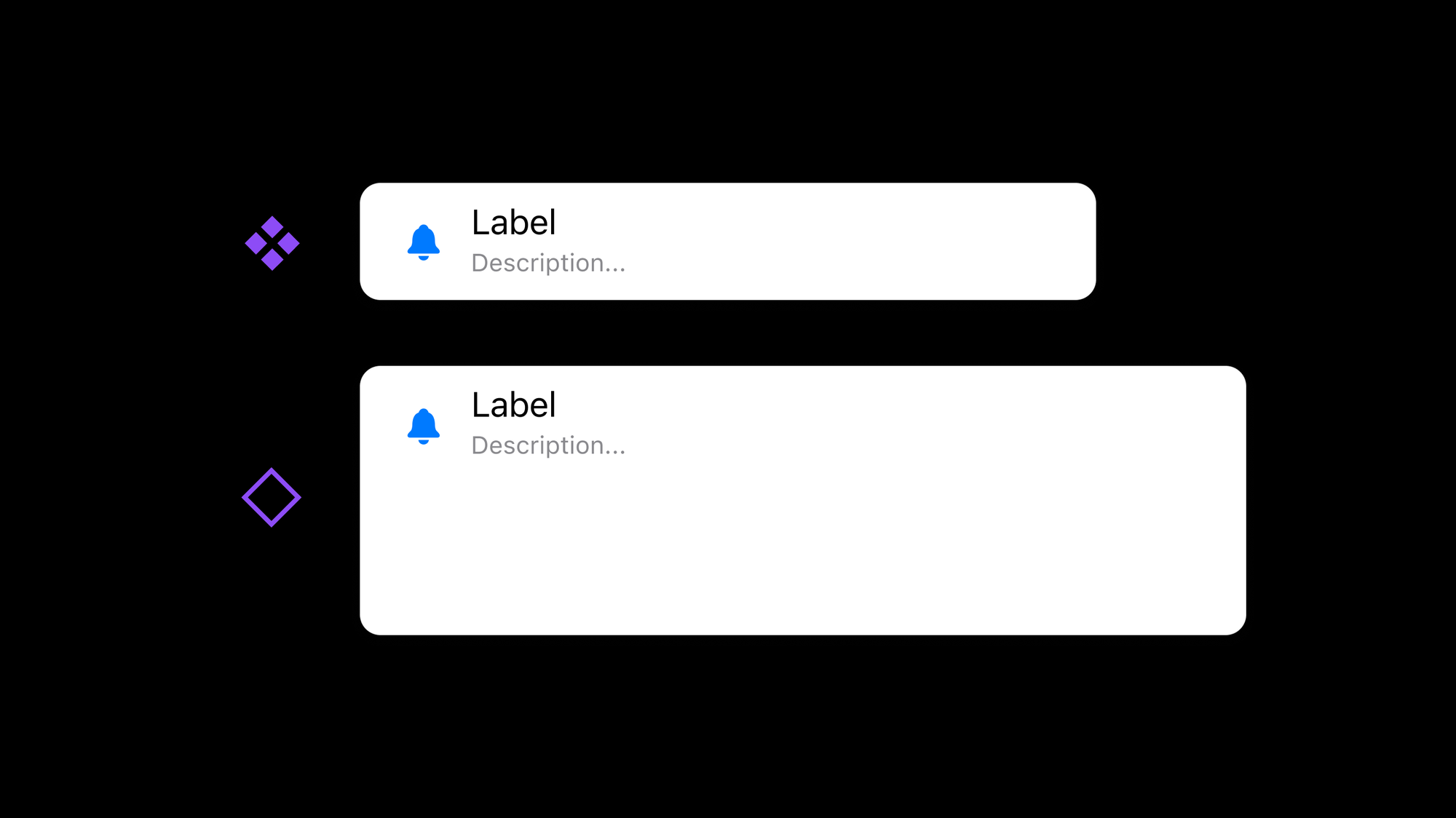
This next step made it all click for me: adjust the sizing of the unfinished instance to see what’s working and, more importantly, what’s breaking. I now have this brand new point of reference as I adjust the original component, and I can immediately see how my auto layout-specific settings impact the instance. For me, this point of instant visual feedback has been so helpful!
Step 4: Add remaining content and make adjustments
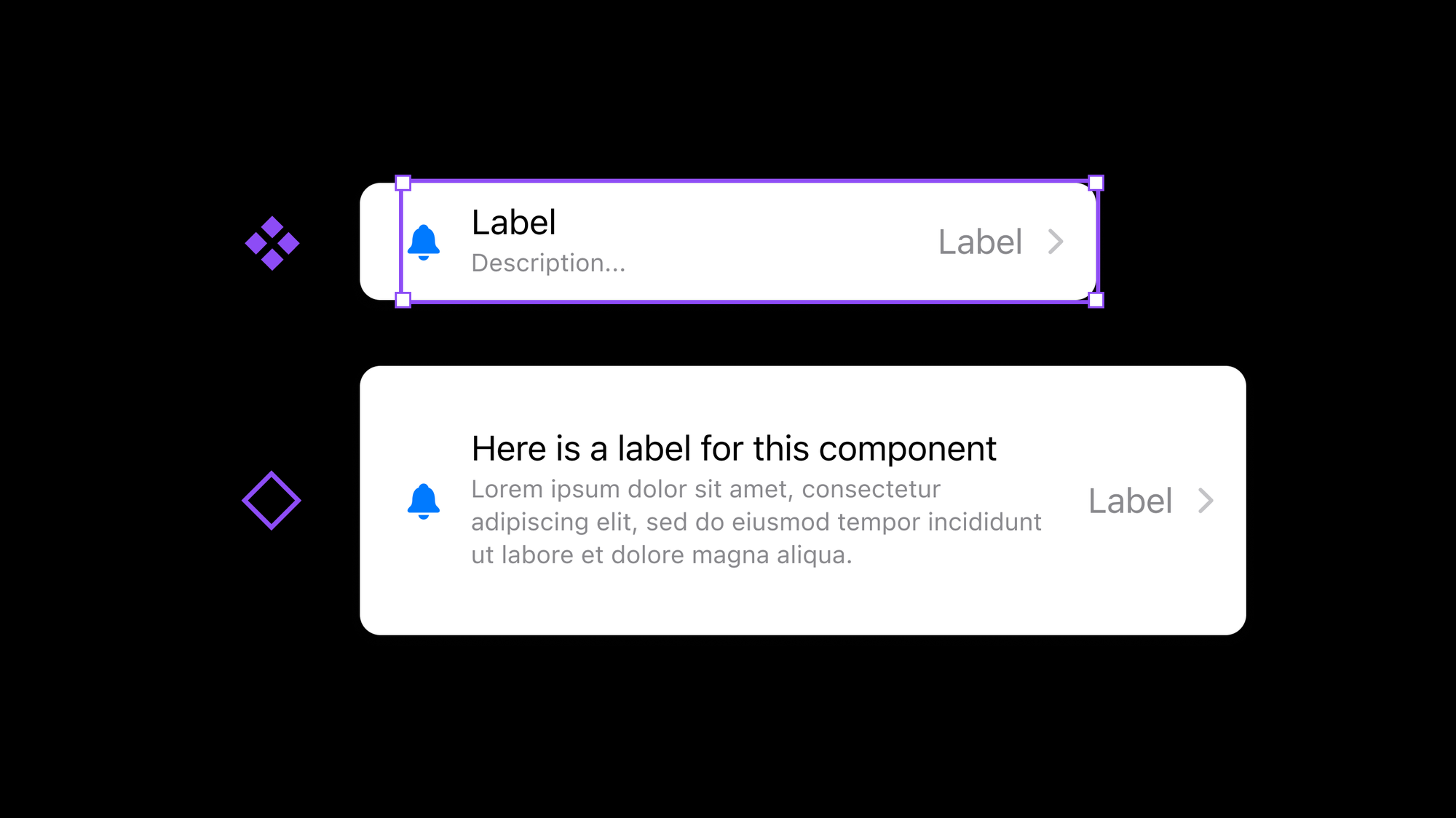
Finally, it’s time to add the remaining content as we continue to make adjustments. In this case, I’ll add the title, description, label, and chevron while making changes to the sizing and alignment properties that auto layout allows. As I go, I still have this point of reference to look at, and because the instance has resized substantially, and includes quite a bit more content, I immediately know if the changes I’m making will result in the correct visual layouts!
A Small Change that Works!
This approach may seem like such a tiny change when reading about it, and really, that’s because it is! By simply modifying the order in which I build components and use layout settings, I can more clearly understand the controls and settings within auto layout, and I know that the component will work well for anyone who uses it within a design of their own.
Does this method work for you, or do you have other auto layout tips? I’d love to know!
In case you missed it...
Level Up with Figma is back for one final cohort of the year! Sign up yourself or your team for our first session on November 25th as we dive into all things Figma, just in time for 2025. 🧑🎓🎨
Thank you to everyone who supports the course—I’m excited to wrap up the year with this community! 💛
Recent bookmarks
- This is what it looks like to be colorblind. 👁️
- Figma's eyedropper tool now supports color variables and color styles in addition to displaying the raw hex. 🎨
- AlDente for Mac is helping me keep my new MacBook Pro's battery healthier for longer. 🍝
- Command X for Mac brings back the ability to cut and paste files within Finder. ✂️
- When muscles work out, they help neurons to grow, a new study shows. 💪
Say hello!
I always love hearing from people, and if you enjoyed this, please reach out! You can find me on Bluesky @joeyabanks. 🦋
Thanks for reading! Take care. 💛


