Baseline #8 – Component Properties in Figma

Hello again! 👋 The last few weeks have been especially tough and especially heavy. I hope this newsletter finds you well and that a little bit of fun and nerdy Figma talk can bring you some happiness today.
At last month’s Config 2022, the Figma team announced a new feature called component properties, which allows for far more instance customization, all while reducing the number of variants that need to exist. It’s the most significant change we’ve seen to what it means to build and maintain components within Figma since the launch of variants in 2020. I’d love to share all that I’ve learned about the feature in this newsletter, including what’s working well, what could be improved, and questions I’m still looking to answer. Let’s get into it!
Figma Focus: component properties

Why component properties?
Figma’s introduction of variants changed how many designers, including myself, approach creating components. Variants provided the ability to turn several separate but related components, into a single asset, with properties and values that can adjust at the instance level. Variants are a handy tool to help designers create extensive and customizable component libraries within the design tool, but because each variant had to visually exist and therefore be represented on the canvas to exist, much more component maintenance and overhead were required. For example, imagine you were working on a notification component with success, warning, and error states, and you wanted to include the ability to either hide or show a close button. With that component, six variants were then necessary: one for each of the three states, and each state needed both a close button is visible, and a close button is hidden option.
The complexity is manageable for something like that notification component, but it doesn’t take much to imagine just how many variants might be required for components that contain more visual items with more configurable states. Even for a component as simple as a button, tens, if not hundreds, of combinations may be required. At its core, reducing this complexity is what component properties aim to help address.
Component properties or variants?
Admittedly, I had some trouble getting started with using component properties because I wasn’t sure how to best think about the new feature in comparison to the previous experience of using and creating variants. I asked myself if component properties should be used instead of the previous variant experience. If so, when and how?
In the past few weeks, I’ve had the chance to become more comfortable creating components that contain component properties. What has helped me the most has been to think of this new feature as an additional way, not a separate way, to further organize and create components and variants that scale with the library and system. If you’re feeling confused, try not to worry! To help clear this up, let’s talk about the different types of properties and how they can each be used.
The four property types
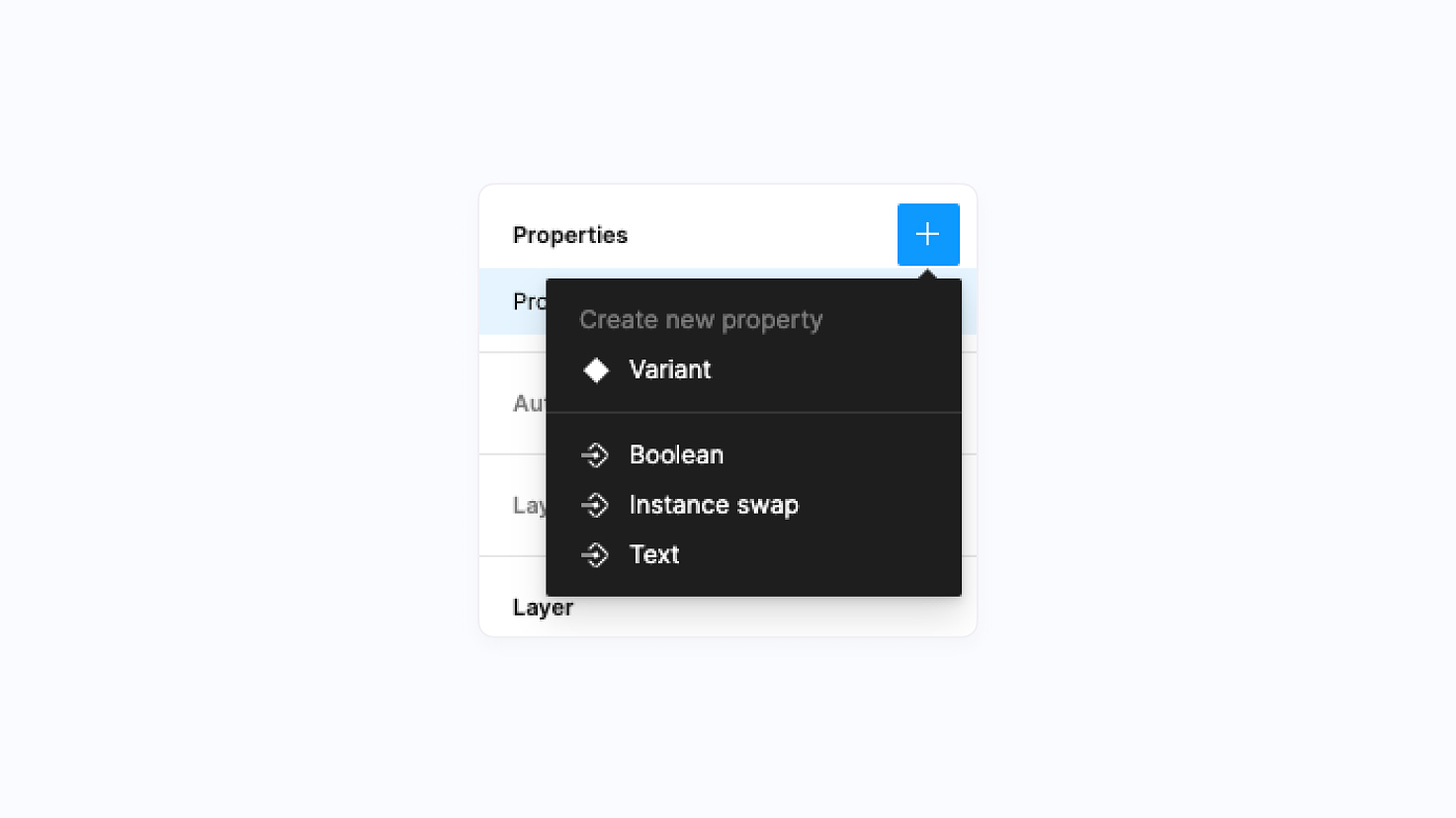
There are now four different property types to work with when creating a component set, and while each one provides something unique and powerful on its own, they can also be combined! What’s so great about each of these is that they can be configured directly at the instance level, and for all types except variant properties, they can be created without needing an actual variant group. Here are the four types:
Variant Properties
Variant properties represent the variants that many of us have come to know and rely on. They’re the items responsible for creating an individual component within a variant group, and as a part of the variant, two modifiers can be assigned: properties and values. Properties are the controllable variables for the component, while values are the options available within each property variable, and there can be an unlimited number of each. If you’re working with a button component, an example of a property might be state with corresponding values such as default or hover.
Instance Swap Properties (new ✨)
Instance swap properties, which are part of the new component properties feature, allow the creator of a component to easily indicate which instances used within the component can be swapped.
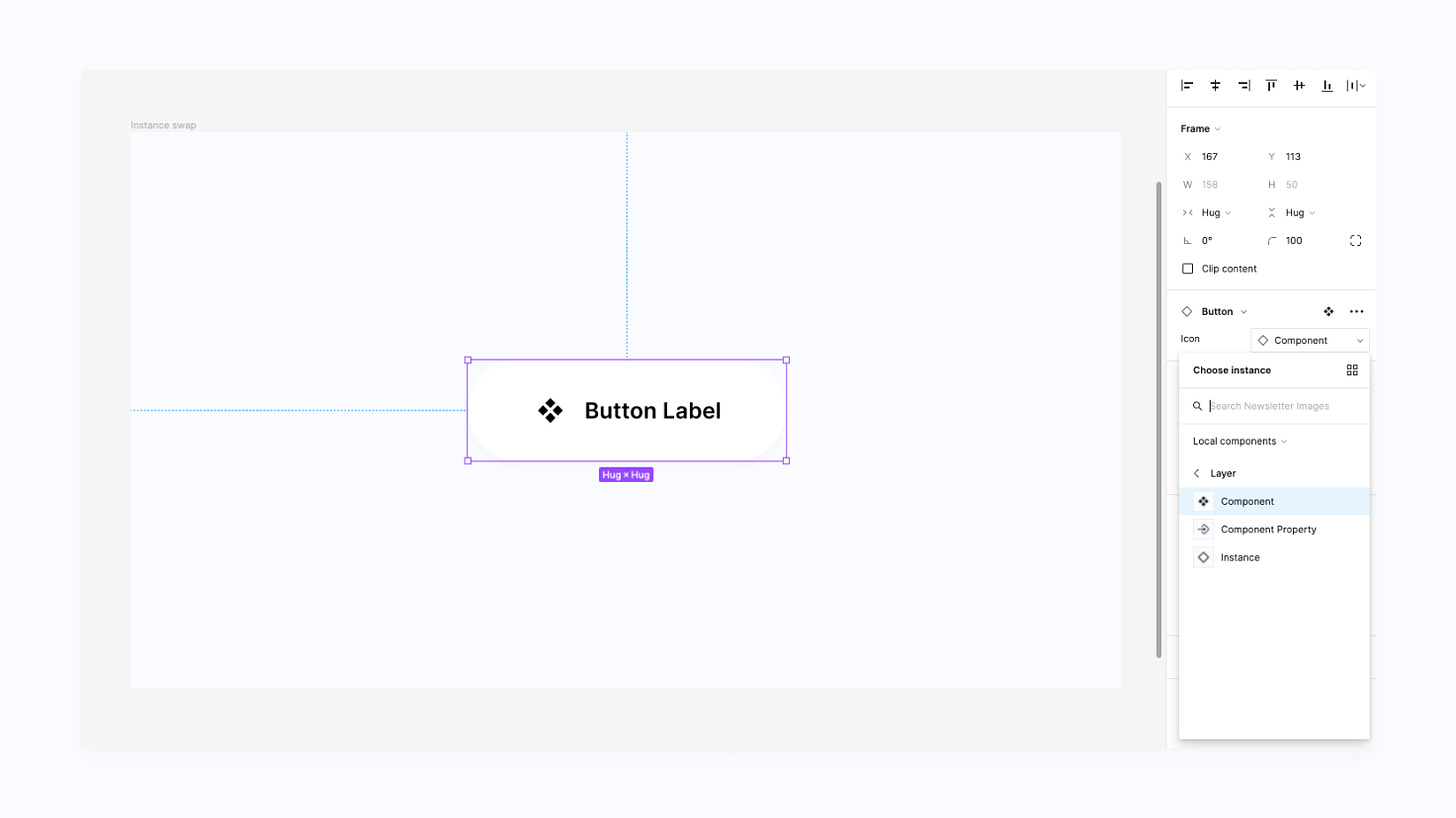
Here’s a quick example of what this new property allows for: let’s imagine you’re creating a button that has an icon inside, and that icon is an instance, perhaps from a larger component library. Instance swap properties allow you to now indicate that the icon can be swapped for another icon. As a result, the instance swapping action is surfaced within the Properties Panel as soon as the button is selected, and there’s no longer a need to deep-click into the button just to swap out the icon. Here’s what that looks like in practice:
Text Properties (new ✨)
When creating a component, text properties can indicate which text layers should or can be edited by the designer who’s using the instance in their work. Instead of having to select the instance, deep-click into the text layer, double-click to edit, and adjust the copy, all that’s needed now is to select the instance, and the text can be easily and quickly changed right from the Properties Panel! If you’re coming from Sketch, text properties will likely be very familiar to you and this definitely feels like a welcomed addition to Figma.
Tip: A practice that I’m doing, which may be helpful for others out there as well, is to match the text layer to the text property. For example, if I’m working with that same button, I might call the text label “✏️ label” (✏️ to help indicate that the copy can, and perhaps should, be adjusted), and I’d then use that exact string to name the text property. Doing this has helped me create a bit of consistency in naming and helps to ensure that instance overrides work as expected, as well!
Boolean Properties (new ✨)
If you're someone who often needs to build large sets of variant groups, boolean properties may just be your new favorite option of the bunch! Boolean properties let you set true or false values for different layers, where true equates to the layer being visible and false means that it's hidden. What's especially great about this property type is that there's no longer a requirement to visually create both the true and false variations on the canvas to represent each state, as boolean properties now automatically handle it all. Remember that notification component that I mentioned at the top of this post, which had an option for a close button? With boolean properties, a property named canClose could be created and then toggled by anyone using the instance. Instead of needing the original six variants, only three would be necessary because of this new type!
What’s working well?
Time saved: Even though component properties are still a new addition to Figma, I feel that it would already be difficult for me to ever imagine giving them up now that they're here and available. Because component properties eliminate the need to create variants for every possible combination that should or could exist for a component, I've been able to save lots of time creating and maintaining component libraries!
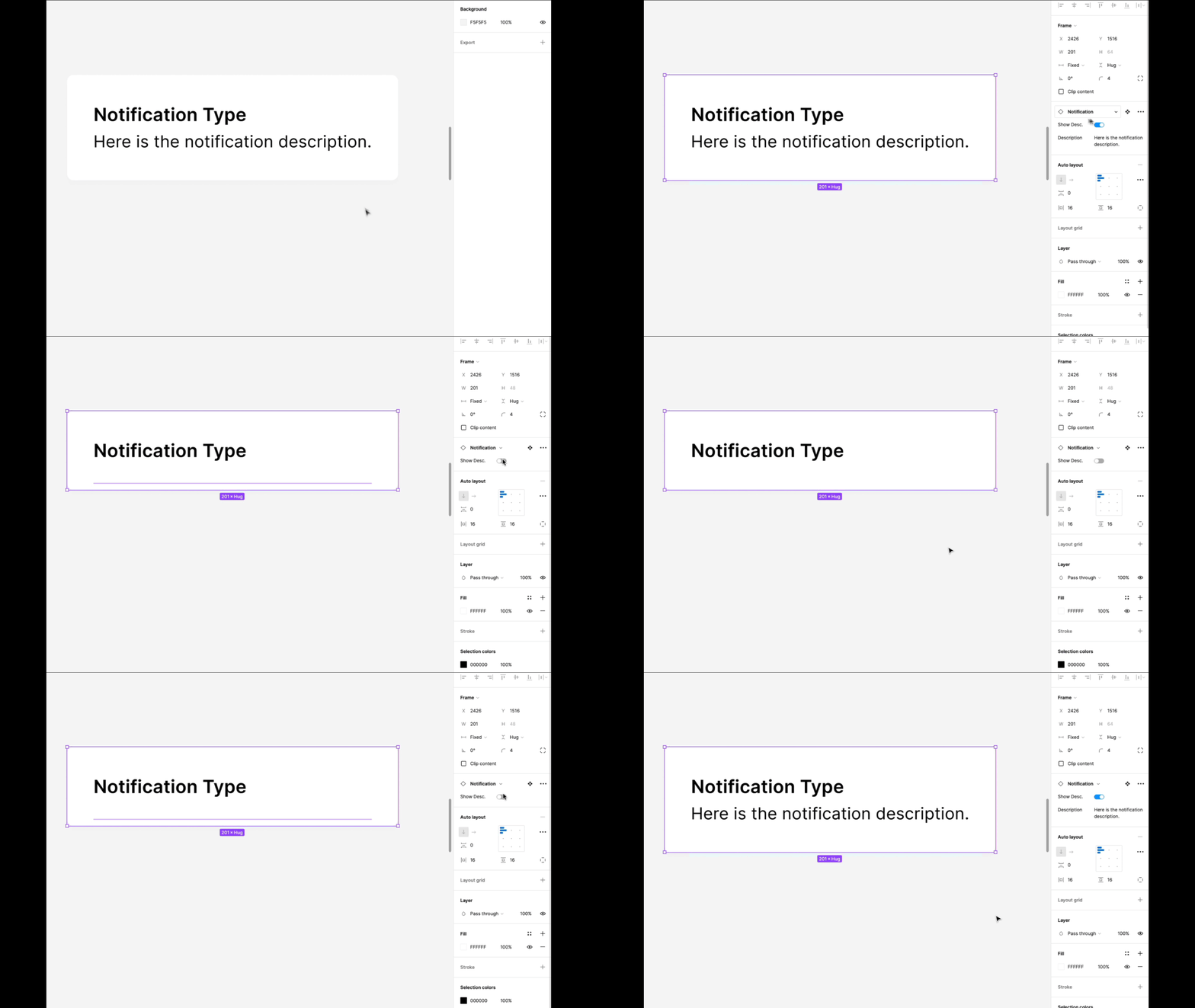
Property Panel relevancy: One of my favorite things about component properties is the ability to map visible layers to relevant properties within the Properties Panel. This means that the ability to now say if Show Description is set to true (or visible), then show the text property to allow a designer to easily adjust the copy. If Show Description is set to false (or hidden), there's no need to show the text property because the description isn't visible. What this does is it helps to show relevant properties only when they would be applicable. It's a fantastic feature and a helpful way to keep the Properties Panel simple and organized. (This happens automatically whenever a layer has both a boolean property and the text property or instance swap property attached).
Easier to create and easier to use: I've recently been thinking more about how creating a component that's easiest for a design system team to maintain can sometimes lead to a worse experience for the designer who's ultimately using the component in their work. However, with component properties, I'm quickly finding that by using this new tool, which allows for faster creation and modification of components, designers who are using the components are also receiving a better experience when using those components, as more adjustment options are immediately available to them through the Properties Panel. Although there's a cost to refactor existing components (more on that soon), things feel like a win-win here!
What could be better?
Losing context: For any team choosing not to rely on large component sticker sheets, one great thing about traditional variants was that every possible option was available to see right on the canvas, making it easy to see the types of states a component could support. Because, by design, component properties allow you to reduce the number of visually created items, this context can be lost, and for any designer or engineer not already familiar with the component, it may feel much more challenging to know what the component can, or can't, do.
Reordering & resizing: This is a small one, and I’m guessing the team at Figma may already be working to solve this, but within the Properties Panel today, traditional variant properties must always be listed above any of the new component property options, which can feel limiting. Additionally, it doesn’t take many characters for property names to begin to truncate within that panel, not making for the best experience—especially if several properties start with the same letter or string. More customization and perhaps indentation here would go a long way for several teams!
Refactoring: If you're feeling ready to take on component properties and want to refactor many of your existing components to use them, that process can be… complex. For a notification component, which supports both a close button and two appearance modes, it may be helpful to use a boolean property to reduce the overall number of components needed down to two. However, a challenge I've found is that through this process, variants are deleted, and any existing instances need to be reset to their default state. While this refactor can mean a more manageable set of components, there's the potential of breaking thousands of instances across feature files. Personally, I've found that for any large component library, with thousands of instances across files, it's hard to know if this work is worth doing at the moment.
(This is a problem I’m still working through, and if there’s an easy solution, please let me know!)

Getting started
From what I've experienced, the easiest way to begin using component properties is to update existing components to use text properties. Starting with this one, in particular, provided me with a lot of insight and learnings about how the new feature works while keeping the risk of breaking existing instances relatively low, too!
Here are a few more helpful links and resources worth bookmarking:
- Create and use component properties, from the incredible support team at Figma.
- Component Properties (Case Study), by my good friend Vic, who designs at Microsoft.
- An excellent Twitter thread from Molly Hellmuth, with five step-by-step component property examples showing how and when to use them.
In case you missed it...
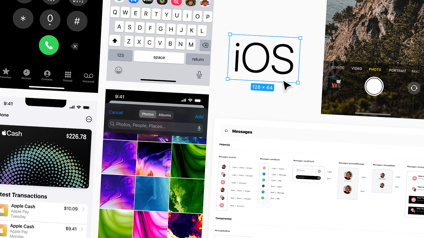
- WWDC starts this Monday, and I'm so excited to be jamming away on this next iOS UI Kit and can't wait to share it soon! The quantity and types of visual adjustments Apple makes to iOS 16 will determine how fast I can put this one out there, but if you'd like to support the project and the work, I'd be incredibly grateful for your help!
- Need to update your resume? I recently published an updated template file to Figma with a few simple resume templates to remix, use, customize, and make your own.
Recent bookmarks
- When it comes to SwiftUI and creative animations, Philip Davis has quickly become one of my favorite Twitter follows. Two recent experiments: a SwiftUI prototype that shows a transition between different densities on the iOS Home Screen and a magnification prototype for the iPhone’s dock.
- I’m constantly changing up the wallpaper I use to keep things feeling new, and this week, I’ve enjoyed using Basic Apple Guy’s Happy Accidents wallpaper collection, which took inspiration from Mac OS X Tiger.
- Naming is often one of the most challenging tasks within design system work, and for a bit of clarity on this, I recently revisited Nathan Curtis’ article Naming Tokens in Design Systems.
- Interested in Apple Shortcuts? Matthew Cassinelli created a new and helpful Twitter Community as a space to share and discuss some of the most powerful workflows.
- Please consider donating to help those affected by the conflict in Ukraine if you can. 🇺🇦
Say hello!
I always love hearing from people, and if you enjoyed this, please reach out! You can find me on Twitter @joeyabanks.


